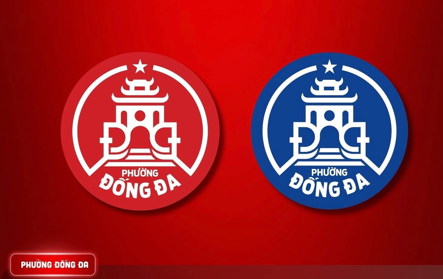
On the afternoon of June 24th, according to information from the newly established Dong Da ward, Dong Da district, the ward's emblem was designed with an overall circular shape, symbolizing wholeness, unity, and harmony between tradition, present, and future. At the center of the emblem is a stylized image of the Trung Liet Temple gate, a prominent structure on Dong Da Hill. Prominently featured on the gate's architecture are the two stylized letters "D," supported by two hands.
The emblem is not only a local administrative identifier, but also carries a profound message about national pride, the spirit of unity and indomitability of the people of this historical land; preserving, inheriting, and developing traditional cultural values; and the aspiration to build Dong Da ward into a civilized, modern, and sustainably developed area, worthy of its position as the central hub of the thousand-year-old capital city.
The new Dong Da ward has a natural area of 2.08 km² and a population of approximately 82,000 people; it was formed by merging all and part of the areas of the following wards: Thinh Quang, Trung Liet, Quang Trung, Lang Ha, O Cho Dua, and Nam Dong.
Source: https://hanoimoi.vn/cong-bo-bieu-trung-phuong-dong-da-moi-706629.html


![[Photo] Prime Minister Pham Minh Chinh presides over the first meeting of the Steering Committee for Cybersecurity in 2026.](https://vphoto.vietnam.vn/thumb/1200x675/vietnam/resource/IMAGE/2026/03/21/1774071141656_dsc-0252-jpg.webp)


Comment (0)