
 |
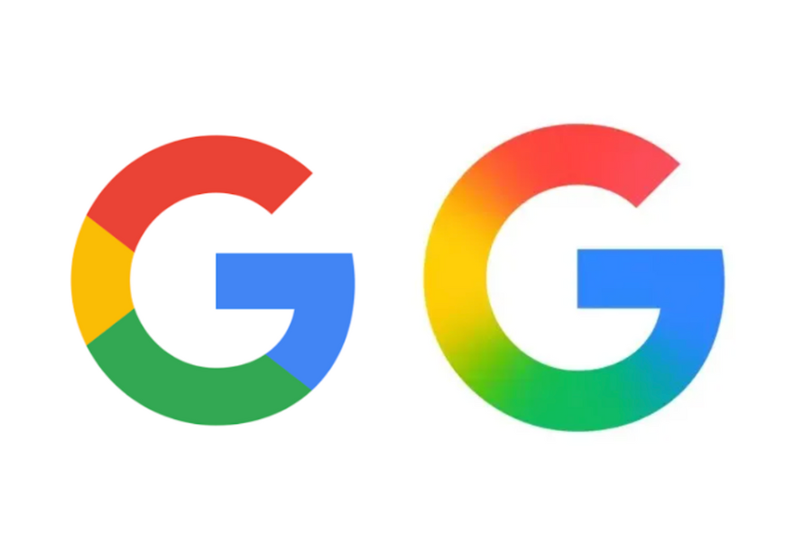
The old (left) and new (right) Google logos. Photo: Google . |
For the first time in almost a decade, Google has refreshed its familiar colorful "G" logo.
According to 9to5Google , the latest update to the Google app on iOS has unveiled a new logo where shades of red, yellow, green, and blue blend together to create an eye-catching gradient effect.
Prior to this, the most recent landmark change to the Google logo occurred in September 2015, when the company decided to switch to a modern sans-serif font. At the same time, Google also introduced a new version of the "G" logo, fully incorporating the brand's iconic colors.
Although this change seems more subtle, the logo with its fresh color blend shows consistency with the gradient design style that Google is applying to the logo of its Gemini AI chatbot.
As of now, it appears Google has only rolled out this logo update to its iOS app. The "G" symbol with its colored dividing lines is still visible on the Android platform and web interface. Google has yet to provide any official response to The Verge 's request for comment.
Since its official launch in 1998, Google began its brand identity journey by using a wordmark (a logo in text form) as the company's main symbol.
A year later, the tech giant decided to simplify its visual identity, switching to a four-color palette, laying the foundation for the familiar colorful logo we know today.
Over the years, the Google logo has been refined to embrace a flatter and more modern design, gradually shaping it into the global icon we see today.
Source: https://znews.vn/google-vua-doi-logo-post1552914.html


![[Photo] Prime Minister Pham Minh Chinh receives the Chinese Ambassador to Vietnam](https://vphoto.vietnam.vn/thumb/1200x675/vietnam/resource/IMAGE/2026/04/05/1775397481797_ndo_br_dsc-5512-jpg.webp)


Comment (0)