
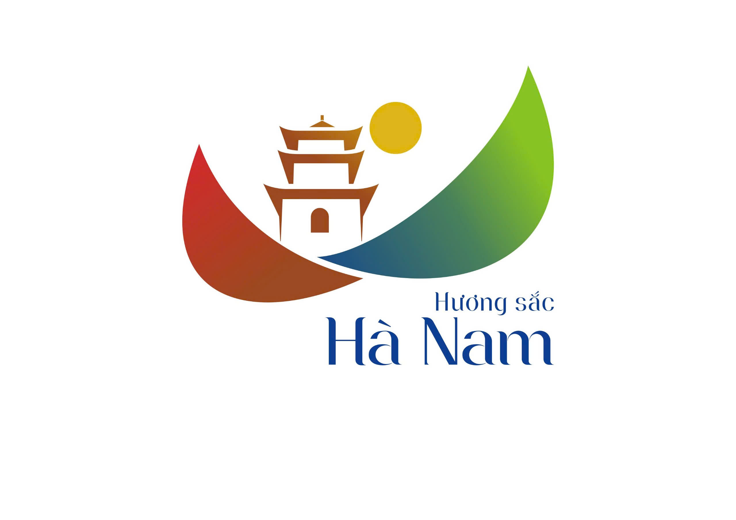
The Ha Nam tourism logo is a combination of images: a kite, Ngoc Pagoda - Tam Chuc, and the sun, representing Ha Nam's key tourism products.
The central image of the logo is the Jade Pagoda – part of the Tam Chuc National Tourist Area. This is one of the largest, most peaceful, and friendly spiritual sites in Vietnam. With its grand scale and numerous unique tourist attractions, it draws a large number of domestic and international visitors to perform spiritual rituals and enjoy a peaceful and friendly experience. This image represents the strengths of cultural, historical, and spiritual tourism in Ha Nam province .
The image of the kite represents the strengths of the province's local cultural tourism. In 2023, the World Travel Awards honored Ha Nam as the "World's Leading Local Cultural Destination". The kite is a very distinctive image for the people of Ha Nam's lowland region, a childhood memory for many generations. Furthermore, it conveys a message of the impetus and development of Ha Nam's tourism in the coming period.
The sun rising above the temple is a very poetic image, emphasizing the lyrical beauty of Ha Nam, a place where visitors can find peace of mind after stressful days filled with the hustle and bustle of life.
The colors red, yellow, and brown represent cultural, historical, spiritual tourism and traditional crafts, while the colors green and blue represent ecotourism.
Previously, the Ha Nam Tourism Logo and Slogan Design Contest aimed to select works that best represented the province's unique characteristics and tourism development strategy. After 5 months of launching , the Organizing Committee received 275 entries , including 127 logos and 148 slogans . The submitted logos are shown below. Many innovative ideas, vibrant colors, and harmonious layouts were presented, suitable for promoting tourism and meeting the criteria and requirements set by the Organizing Committee, especially in showcasing the unique characteristics and identity of Ha Nam tourism . Regarding slogans , most were concise, succinct, and effectively conveyed messages about the history, culture, nature, and people of Ha Nam; some slogans also reflected the province's tourism development strategy and goals.
After two rounds of judging, the jury selected six logo designs to advance to the final round. The competition organizers conducted a poll on the Ha Nam Provincial Electronic Information Portal and the province's official social media pages. Following the poll, the results are as follows:
One entry won first prize (Author: Dao Anh Tai, Da Nang).
Five works received honorable mention awards (Authors: Tran Van Nghia - Hanoi; Cu Hong Son - Hung Yen; Le Cong Dao - Da Nang; Vo Duy Hiep - Thua Thien Hue; Nguyen Duy Thanh - Hanoi).
The winning logo will be used uniformly for all information dissemination, tourism promotion, and marketing activities; serving the political, economic, cultural, and social development tasks, as well as domestic and foreign affairs related to tourism in the province. Simultaneously, it will serve as the brand identity for Ha Nam tourism, aiming to present an impressive and professional image of Ha Nam tourism in tourism products and media, thereby attracting tourists and investors .
Source: https://svhttdl.hanam.gov.vn/Pages/cong-bo-bieu-trung-logodu-lich-ha-nam.aspx


Comment (0)