.jpg)
Artist Nguyen Ngoc Huy Man has over 20 years of experience in designing administrative logos.
It originated from a symbol.
Huy Man's passion for painting began early. During his middle school years, this young student was familiar with drawing for school bulletin boards, participating in children's competitions, and decorating camps for his school, class, and local community. Painting became an integral part of his life – a place where he could observe, express, and nurture his aesthetic sensibilities.
A crucial turning point came during his high school years, when Quang Nam and Da Nang were separated. The moment the Da Nang city logo, designed by artist Nguyen Thuy Lien, was unveiled to the public not only marked an administrative change but also awakened the passion for symbolism in the artist, born in 1981. He realized that through a logo, one could tell the story of a city's history, identity, and aspirations.
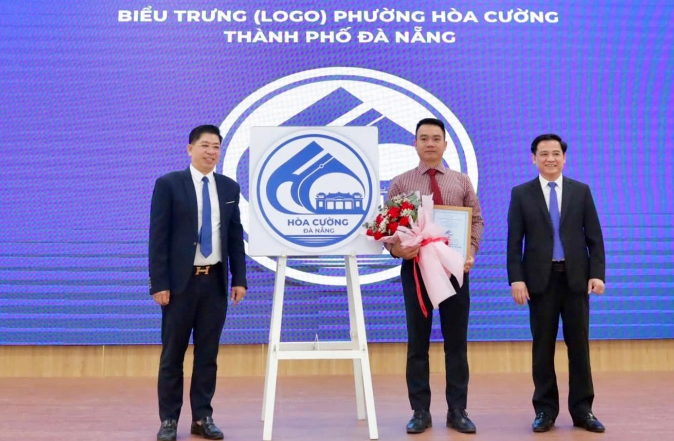
Artist Huy Mẫn (second from the right) with his design for the Hòa Cường ward logo.
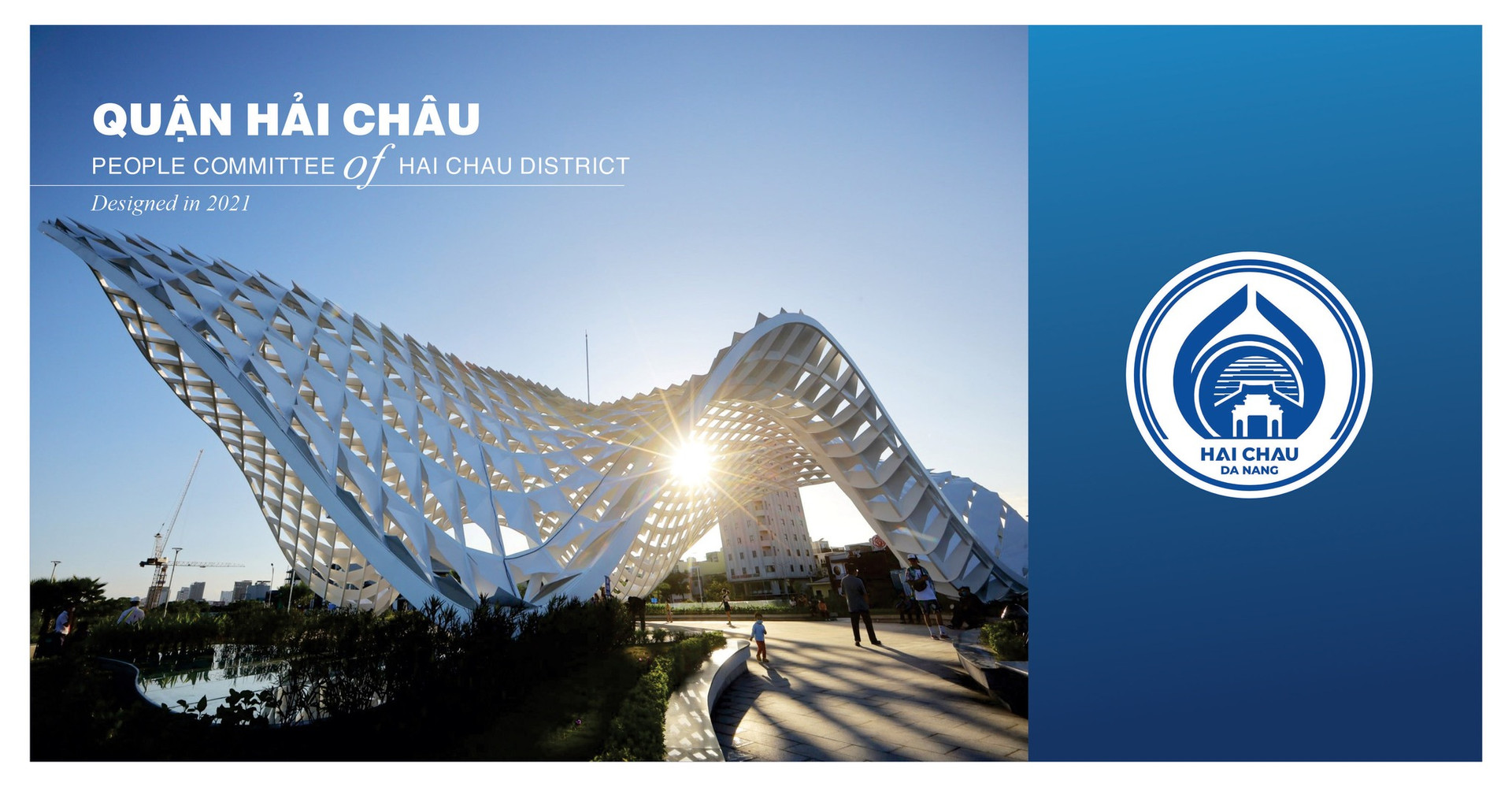
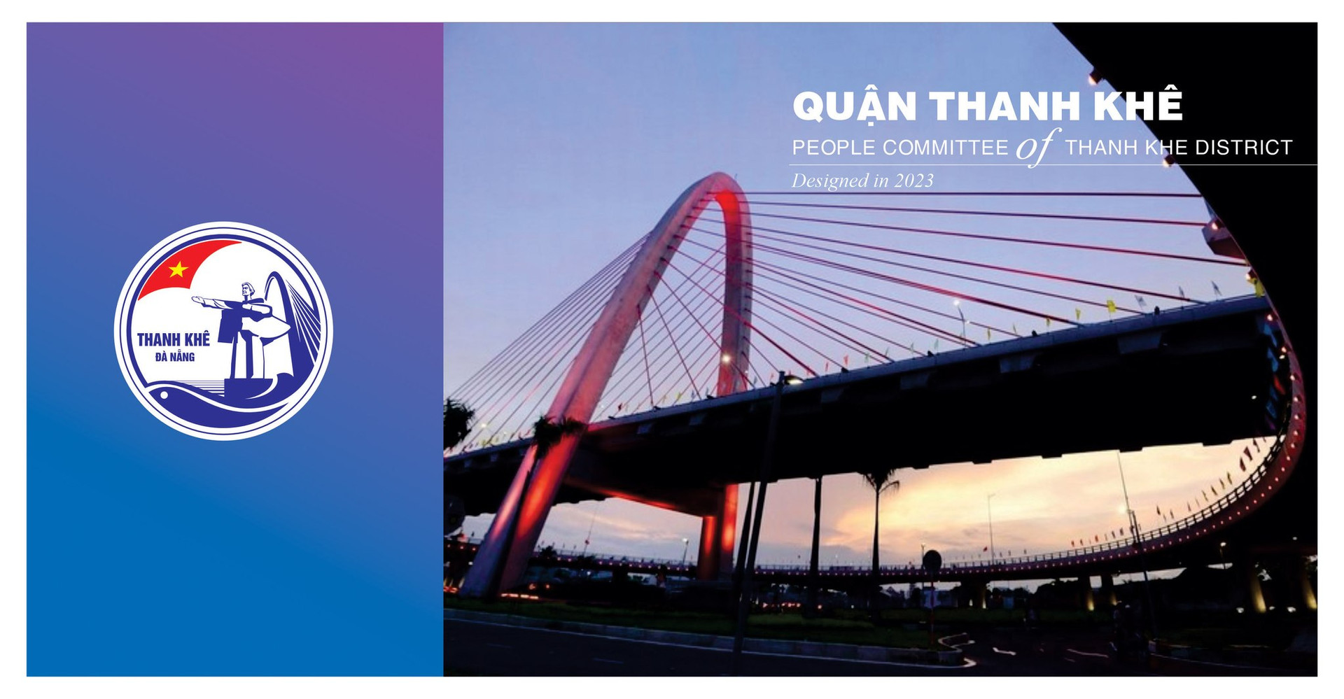
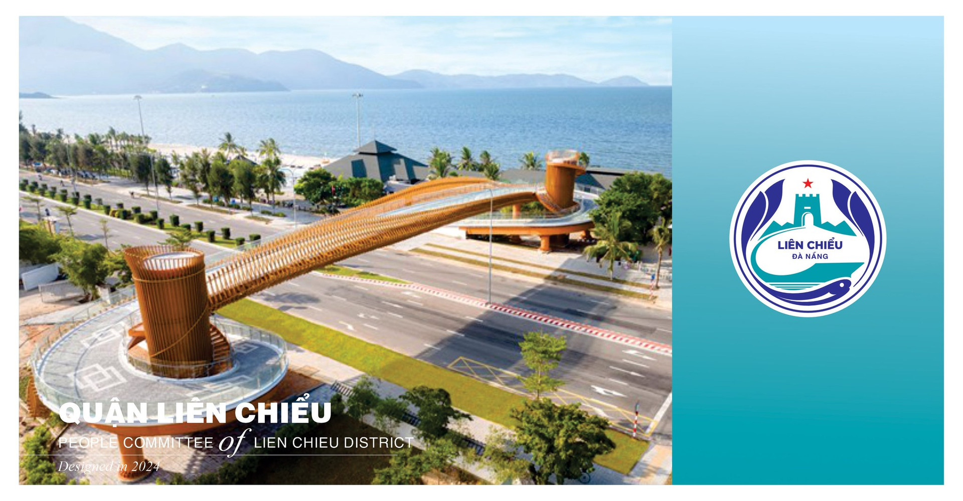
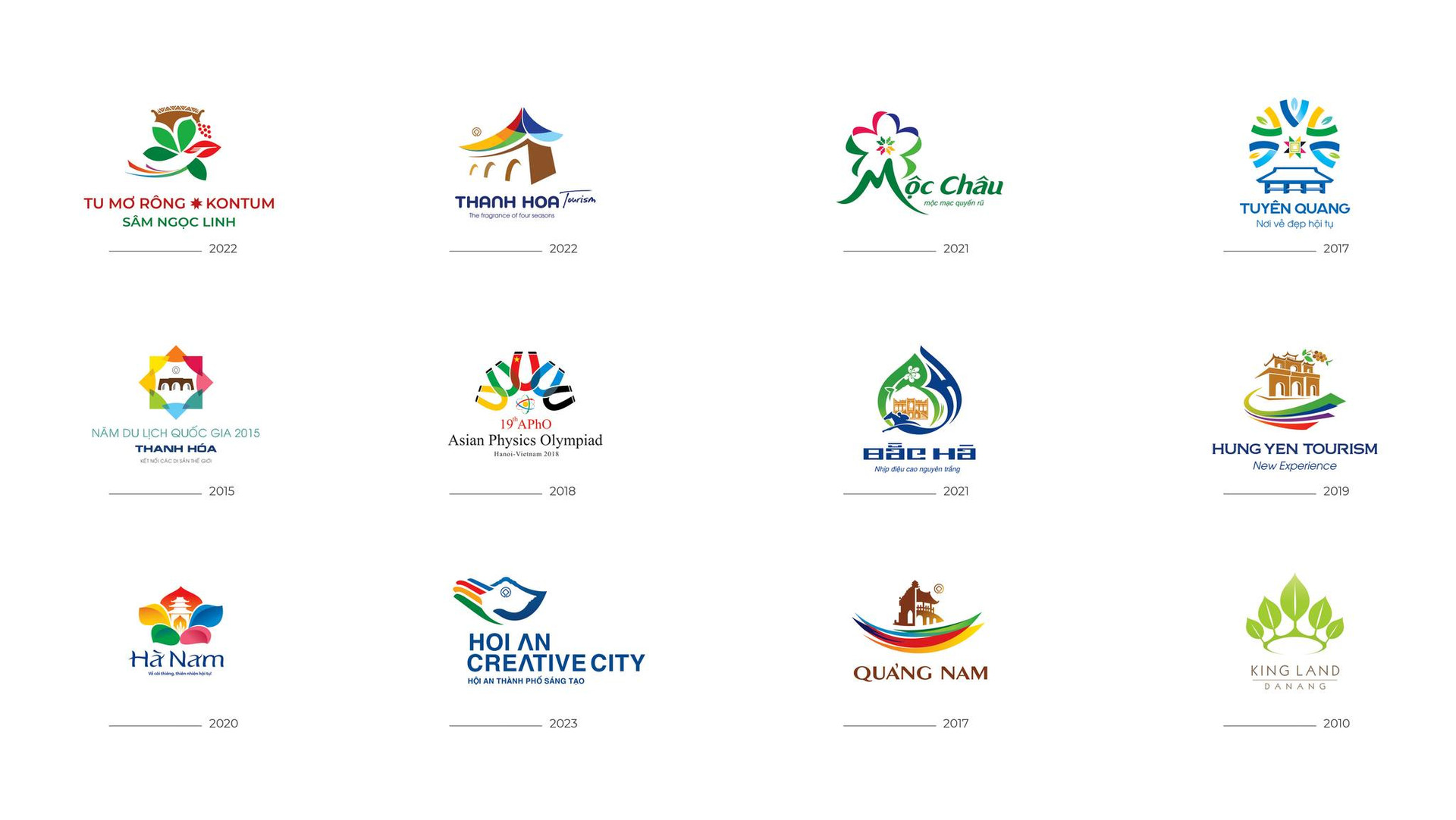
The logos of some districts and communes of Da Nang and Quang Nam in the past were designed by artist Huy Man.
From that moment, the idea of pursuing administrative logo design quietly grew, accompanying Huy Man throughout his years of study and later career choices. Over twenty years dedicated to the profession, he has created hundreds of logos for numerous localities across the country, from communes, wards, and (former) districts to important political events.
The emblem for the First Congress of the Party Committee of the National Assembly, term 2025-2030, designed by him, is one of his exceptional creations. The work demonstrates a harmonious connection between political spirit, national traditions, and modern thinking in a tightly structured yet highly artistic manner.
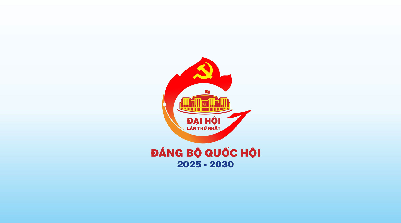
The emblem for the First Congress of the Party Committee of the National Assembly, term 2025-2030, was designed by artist Huy Mẫn and officially used at the congress.
“The crane spreading its wings and transforming into a fragrant lotus flower is the source of my idea, the intersection of tradition and modernity, between the roots of a thousand-year-old culture and the aspiration for innovation today. In that symbol, I convey the image of a country transforming and integrating, proudly stepping into a new era,” he shared.
You may also like

Nam Giang commune organizes a public forum to gather feedback on the development of officials.On the morning of June 25th, the Vietnam Fatherland Front Committee of Nam Giang commune, in coordination with the People's Committee of the commune, organized a People's Forum to contribute ideas to building a team of commune officials, civil servants, and public employees in 2026, aiming to improve the quality of service to the people and preserve local cultural identity. Telling stories of lands
For Huy Mẫn, the logo is not just a means of identification, but also a "record" of culture distilled through graphic language. "Each work is a tribute I send to the land that has nurtured and cultivated the beautiful values of its people," he expressed. Therefore, he views designing administrative logos as a dialogue with the land whose story he is telling.
That dialogue began with a rigorous research process: reading historical documents, studying culture and beliefs, conducting fieldwork, observing daily life, and conversing with local people. In each project, Huy Mẫn dedicates significant time to this preparation phase. According to him, only by thoroughly understanding the land and its people can a designer choose a representative image that both meets legal requirements and has lasting vitality within the community.
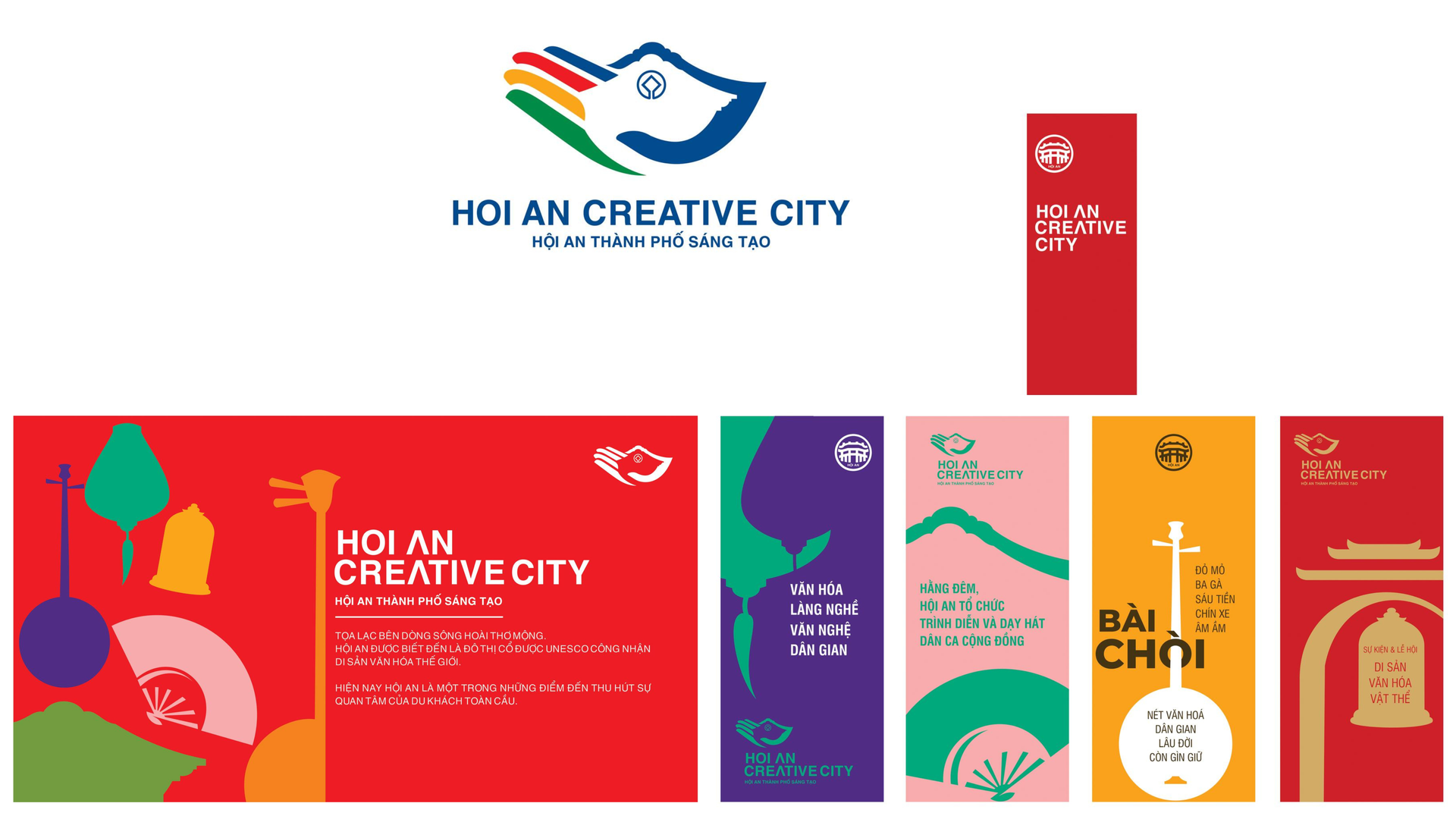
The logo "Hoi An - Creative City" conveys a message about two distinctive areas of Hoi An: handicrafts and folk art, within the UNESCO Creative Cities Network.
Therefore, the brilliance of Nguyen Ngoc Huy Man's administrative logos lies in their ability to evoke collective memories. With the An Khe ward logo – the winning entry and chosen as the official emblem – he opted for storytelling through familiar yet meaningful imagery.
The image depicts a dove soaring upwards with stylized eyes resembling blooming plum blossoms. The national flag is gracefully shaped like a bird's wing. The circle of microcircuits suggests the rhythmic movement of technology. The industrial wheel is a metaphor for the North-South railway line.
The details are carefully considered and harmoniously connected, skillfully integrated with characteristic symbols of the region such as the Hue intersection overpass, Nghi An village communal house, and Phuoc Tuong mountain range. All of this creates an image of An Khe ward rich in identity, undergoing transformation, innovative, intelligent, and with a desire for connection.
.jpg)
The logo for An Khê ward, designed by artist Huy Mẫn, has been chosen as the official emblem of the locality.
With the logo of Tra Linh commune, the story is told in the language of the mountains and forests. The image of blooming Ngoc Linh ginseng flowers at the center, surrounded by 10 ginseng seeds forming a radiant sun, symbolizes life and spreading vitality. Three ginseng leaves intertwine in a soft circle like connected hands, allegorizing the unity between the government, the people, and nature in the journey of building a sustainable region.
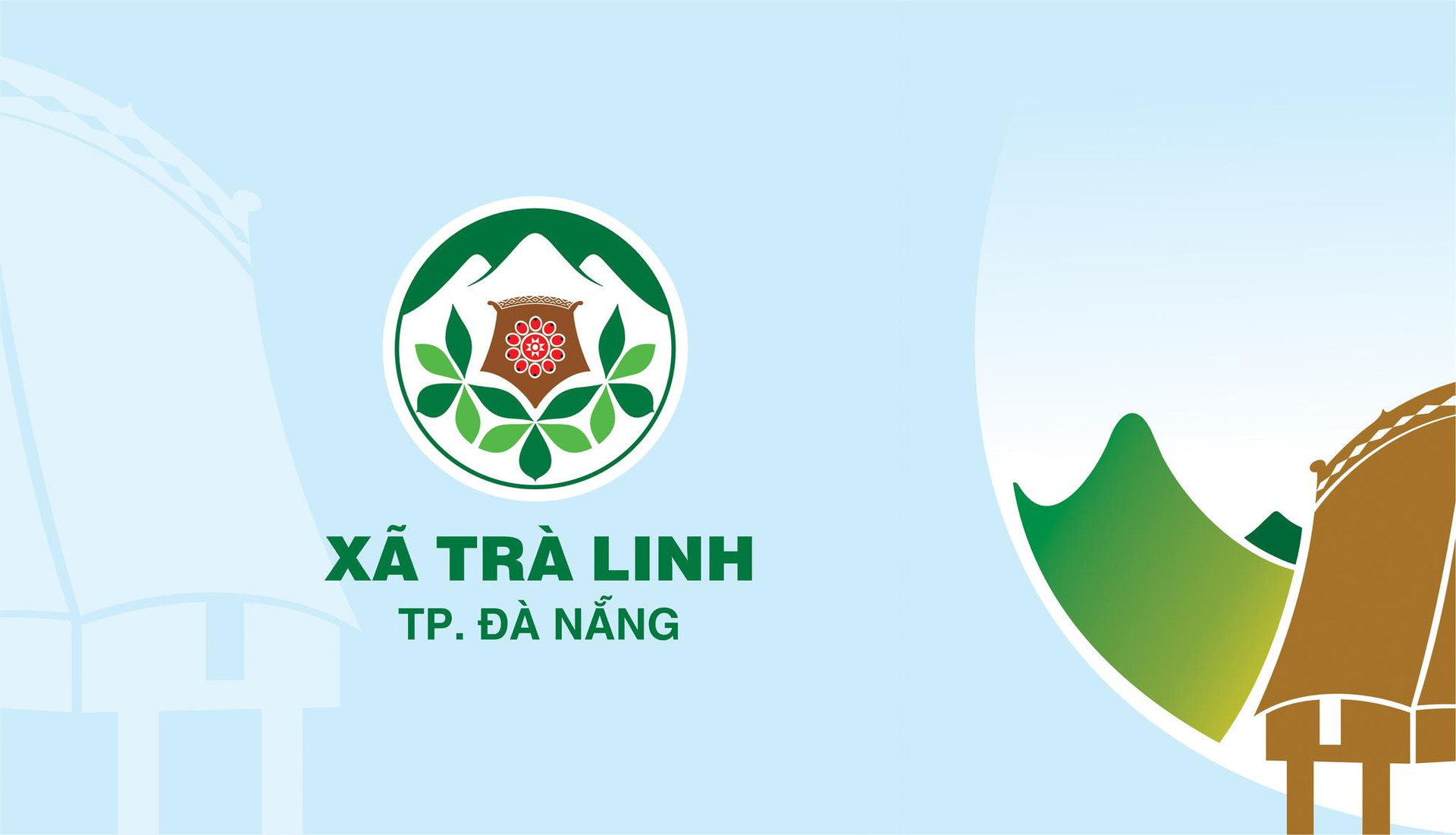
With the logo of Tra Linh commune, artist Huy Man tells the language of the mountains and forests.
The presence of ginseng flowers, communal houses, the Ngoc Linh mountain range, and the green-brown-red color scheme create a harmonious overall effect, reflecting the close relationship between people and the forest land, and the aspiration of Tra Linh to rise above the vast wilderness.
Each region offered Huy Mẫn a different way of storytelling. In Việt Yên (Bắc Giang), it was the space of Quan Họ folk singing, Bổ Đà Pagoda, and traditional craft villages; in Thái Bình, it was Keo Pagoda and Chèo singing; in Thanh Hóa, it was the historical depth of Hồ Dynasty Citadel, Lam Kinh, and its system of festivals; and in Quy Nhơn, it was the spirit of a "city of poetry"...
Designing an administrative logo requires careful consideration of culture, history, and community sentiment.
According to Huy Mẫn, designing administrative logos requires meticulous attention to detail and high discipline. The designer must find an image that is both easy to understand and communicate, while also being comprehensive enough to represent the region. This stringent requirement means that each logo is not only an aesthetic challenge but also a careful consideration of culture, history, and community sentiment.

Vietnam encourages US businesses to expand investment in high technology.On the morning of June 26th, at the Government Headquarters, Deputy Prime Minister Ho Quoc Dung received Mr. Jeff Place, Supply Chain Director of Coherent Group (USA). During the meeting, the Deputy Prime Minister affirmed that Vietnam encourages US businesses to expand investment, especially in high-tech, innovation, and semiconductor industries. "It's a challenge that requires the designer to have a very deep understanding of the land they're telling the story about and the courage to choose the most impactful detail," he confided.
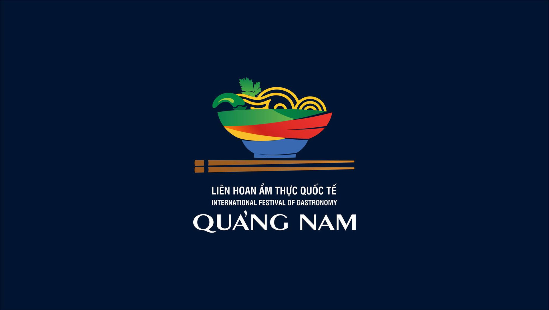
The logo of the Quang Nam International Food Festival, featuring Quang noodles as the main image, aims to honor, preserve, and promote the cultural, culinary, and tourism values of the former Quang Nam province.
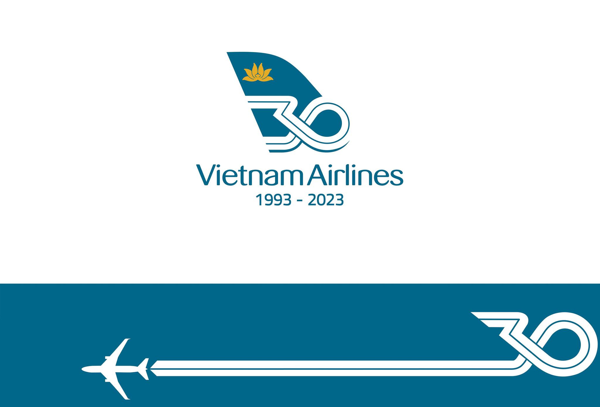
The logo commemorating the 30th anniversary of Vietnam's national airline.
The image of the graceful conical hat in the designs of artist Huy Mẫn.
Respect for local identity has become a unifying thread throughout his works, simultaneously creating a unique Nguyễn Ngọc Huy Mẫn in the field of public administration logo design. Numerous national and international awards are recognition of this persistent journey. But for Huy Mẫn, the greatest happiness is seeing his work accepted and loved by the people.
Source: https://baodanang.vn/nguoi-hoa-si-ke-chuyen-bang-logo-3319119.html


