
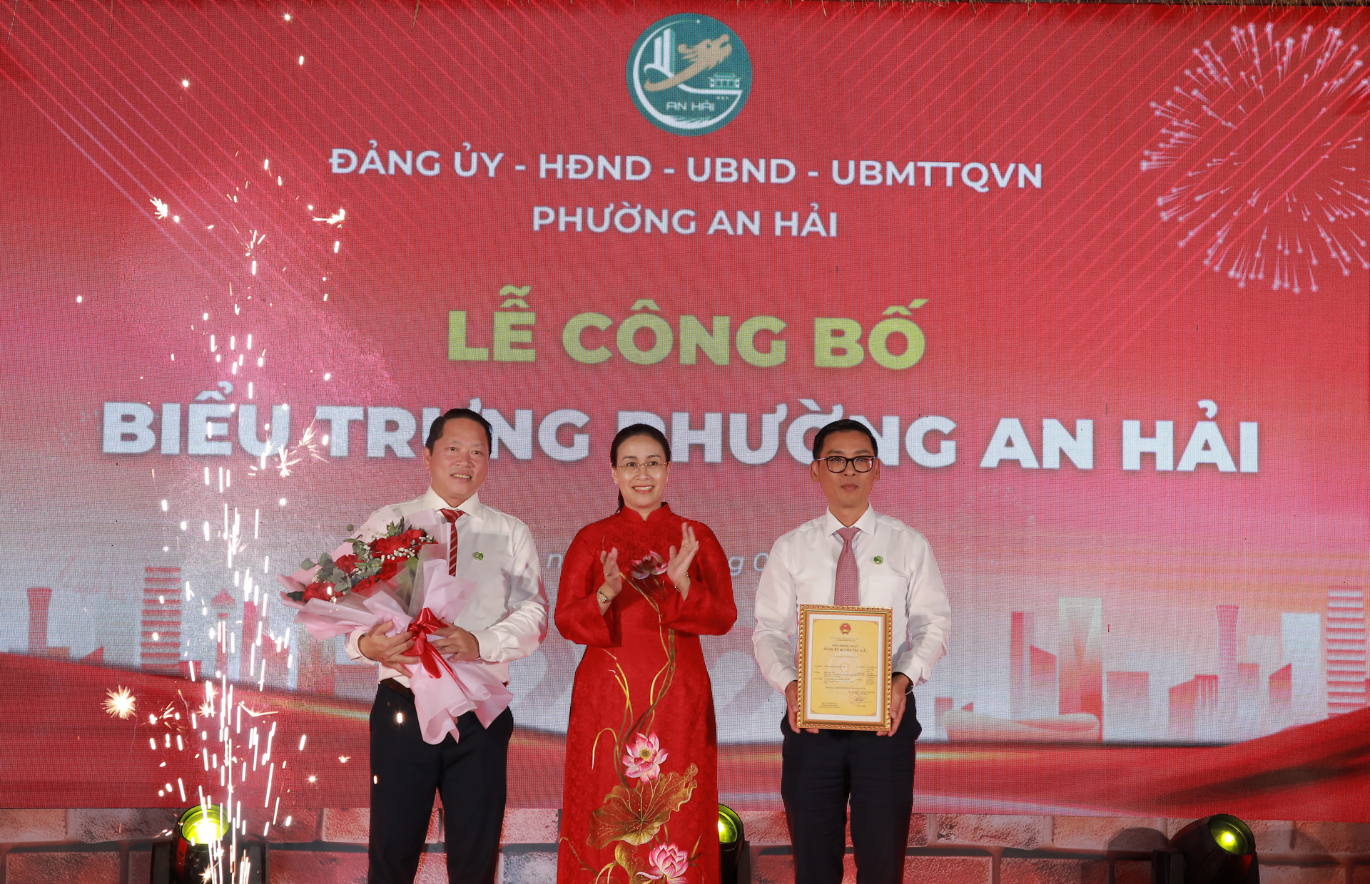
The An Hai ward emblem is designed within a central circle, representing the unity of the ward's Party Committee and people. The arc opening towards the East symbolizes the ward's potential for marine economic development . The green color represents nature, longevity, and the ward's greening initiative.
Along with that, the emblem showcases many distinctive features of An Hai ward, such as the Dragon Bridge, the Love Bridge, the Thoai Ngoc Hau Temple, My Khe beach, the marina, and characteristic high-rise buildings, aiming to convey the message of a dynamic, green, smart, and sustainably developing An Hai.

The unveiling of the new logo aims to create a distinctive identity, contributing to the promotion of the traditions, cultural identity, history, potential, and people of An Hai; while also fostering a spirit of unity, pride, and responsibility among each citizen in building an increasingly prosperous and civilized homeland.

An Hai ward was established by merging An Hai Bac, An Hai Nam, and Phuoc My wards, with a natural area of 7.37 km2 and a population of 82,635 people.
Source: https://baodanang.vn/cong-bo-bieu-trung-cua-phuong-an-hai-3323401.html

![[Photo] The courage of new recruits of Brigade 144 on the training ground.](https://vphoto.vietnam.vn/thumb/1200x675/vietnam/resource/IMAGE/2026/05/27/1779881651341_anh-man-hinh-2026-05-27-luc-18-32-52.png)

![[Photo] The heat at the fireworks display site on the opening night of the Da Nang International Fireworks Festival 2026](https://vphoto.vietnam.vn/thumb/1200x675/vietnam/resource/IMAGE/2026/05/27/1779889741485_ndo_br_z7872039145157-fecaba5112f39e8352544099d7ef4738-5140-jpg.webp)


![[Photo] The courage of new recruits of Brigade 144 on the training ground.](https://vphoto.vietnam.vn/thumb/402x226/vietnam/resource/IMAGE/2026/05/27/1779881651341_anh-man-hinh-2026-05-27-luc-18-32-52.png)


Comment (0)