
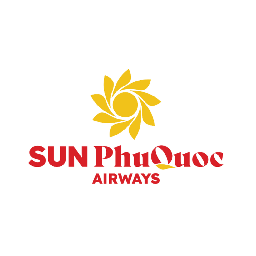
Sun PhuQuoc Airways brand identity logo.
SPA's logo is the crystallization of the brand philosophy and global connection mission of the pioneer resort airline in Vietnam.
The center of the logo is the image of the sun - a symbol throughout theSun Group ecosystem. This will also symbolize the philosophy of placing passengers at the center of all sustainable development orientations and service improvements of the airline.
Revolving around the sun are nine stylized, soft petals that move clockwise, symbolizing the spread of positivity and the constant journey forward.
It can be seen that the 9 petals represent 9 service qualities: telling the story of a perfect journey, starting from a foundation of safety and integrity, nurtured by a dedicated, empathetic, and delicate heart, bringing passengers to classy, creative, and connected experiences, and then sublimating in every emotion.
Each petal is also a connection, a delicate touch on the flight journey with Sun PhuQuoc Airways. Accordingly, the 9 connections are: destination; culture; tourists; experience; emotion; community; future; ecosystem and Vietnamese aspiration. The 9 touch points are: touch emotions; touch quintessence; touch identity; touch heart; touch aspiration; touch relaxation; touch difference; touch class; touch destination.
The main color of the Sun PhuQuoc Airways logo is the pure golden yellow of sunlight, representing warmth and positive energy. This is also the light that starts every flight, combined with the brilliant and luxurious deep red of the airline name "Sun PhuQuoc Airways" to create a striking overall look in the sky.
When applied to the fuselage, this logo will change color to a modern metallic orange-gold, shining brightly like the sun - expressing the pioneering spirit and distinct visual style of the airline. In particular, the "Q" hyphen in the name "PhuQuoc" is also shaped like an island emerging in the middle of the ocean, reminiscent of Vietnam's pearl island.
From the brand logo, the flight journey with Sun PhuQuoc Airways has been shaped as a classy and unique experience, with relaxing and smooth emotions that anyone can reach.
According to the representative of Sun PhuQuoc Airways, the brand logo is not only the first step in terms of image, but also a declaration for the long-term brand strategy: taking off from identity - reaching out through experience.
"Taking off from identity" right from the name, logo to service philosophy, Sun PhuQuoc Airways has placed Vietnamese culture and the local spirit of the Pearl Island at the center. "Reaching out with experience" because the resort aviation model that SPA pursues is not simply transportation, but also a journey of experience designed in sync from the sky to the ground. Every moment on the flight is a delicate mark, created by dedicated care and heart-felt services.
According to the roadmap, after announcing the brand identity logo, Sun PhuQuoc Airways will continue to implement important steps, moving towards opening ticket sales in October this year and aiming to carry out the first commercial flight as soon as possible.
Source: https://nhandan.vn/sun-phuquoc-airways-ra-mat-logo-nhan-dien-thuong-hieu-ban-sac-viet-vuon-tam-quoc-te-post888885.html


![[Photo] The 9th Party Congress of the National Political Publishing House Truth](https://vphoto.vietnam.vn/thumb/1200x675/vietnam/resource/IMAGE/2025/6/24/ade0561f18954dd1a6a491bdadfa84f1)
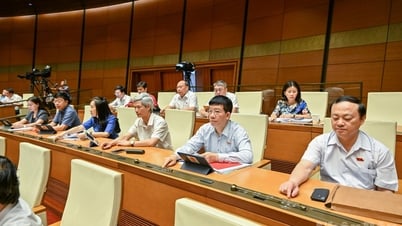
![[Photo] General Secretary To Lam meets with the Group of Young National Assembly Deputies](https://vphoto.vietnam.vn/thumb/1200x675/vietnam/resource/IMAGE/2025/6/24/618b5c3b8c92431686f2217f61dbf4f6)
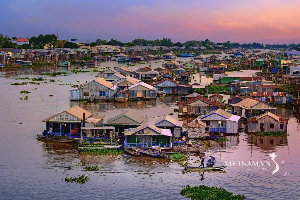
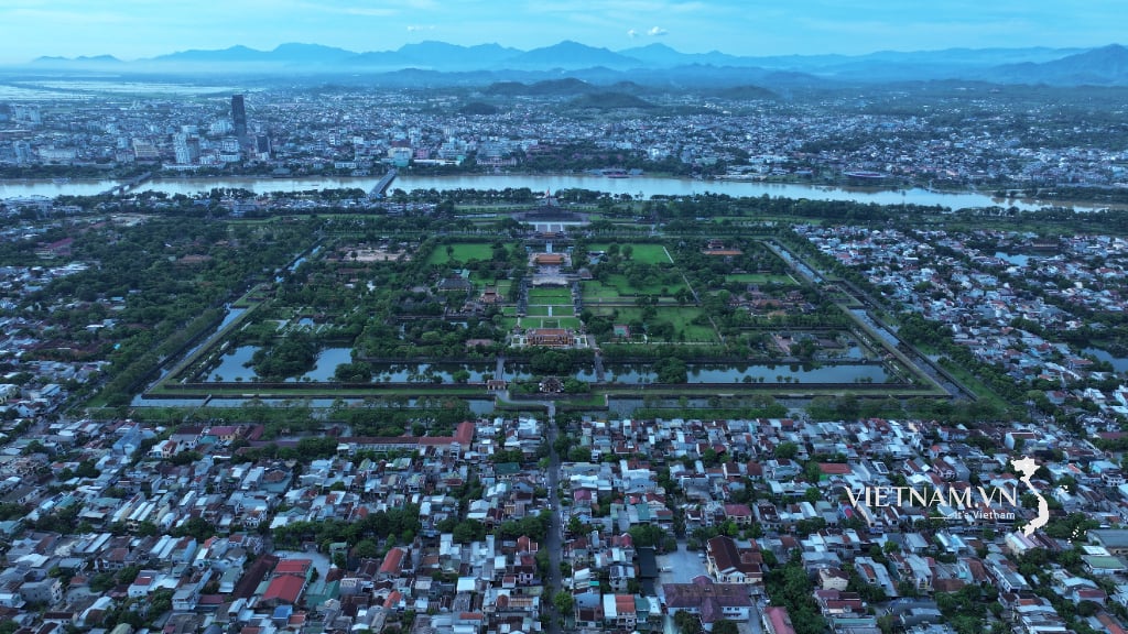
![[Photo] Close-up of modernized Thu Thiem, connecting new life with District 1](https://vphoto.vietnam.vn/thumb/1200x675/vietnam/resource/IMAGE/2025/6/24/d360fb27c6924b0087bf4f288c24b2f2)


![[Photo] General Secretary To Lam meets with the Group of Young National Assembly Deputies](https://vphoto.vietnam.vn/thumb/402x226/vietnam/resource/IMAGE/2025/6/24/618b5c3b8c92431686f2217f61dbf4f6)
![[Photo] Close-up of modernized Thu Thiem, connecting new life with District 1](https://vphoto.vietnam.vn/thumb/402x226/vietnam/resource/IMAGE/2025/6/24/d360fb27c6924b0087bf4f288c24b2f2)
![[Photo] Prime Minister Pham Minh Chinh attends the Vietnam-China Business Connection Forum](https://vphoto.vietnam.vn/thumb/402x226/vietnam/resource/IMAGE/2025/6/24/f8e4b8223ab64fa0a1fe8ee58a36b57a)
![[Photo] The 9th Party Congress of the National Political Publishing House Truth](https://vphoto.vietnam.vn/thumb/402x226/vietnam/resource/IMAGE/2025/6/24/ade0561f18954dd1a6a491bdadfa84f1)


Comment (0)