
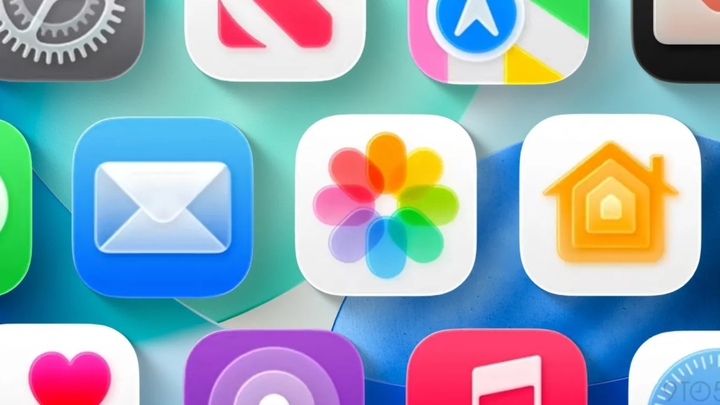
Based on the new design philosophy called Liquid Glass, on iOS 26, Apple not only refreshed the interface of system components such as buttons or navigation bars, but also redrawn all the original application icons. Each icon is no longer simply a representative image of the application, but becomes part of a unified design vision across the entire ecosystem: iOS, macOS, watchOS and visionOS.
Apple 'overhauled' all app icons on iOS 26. (Source: 9to5mac)
Previously, each of Apple's platforms had its own icon style: macOS used 3D effects and drop shadows, watchOS used round icons that were not in sync with visionOS, while iOS stuck to the signature "squircle" shape - a square with rounded corners. With iOS 26, Apple redefined the entire icon system: All use the same squircle shape with a larger corner radius, creating a soft, modern, and consistent feel.
Apple has also introduced new design guidelines for the alignment of icons – especially circles – to ensure a harmonious and visually balanced proportion. Even without the need for complex animations, users can still easily see the sophistication, elegance and class of the icon set on iOS 18.
Clock
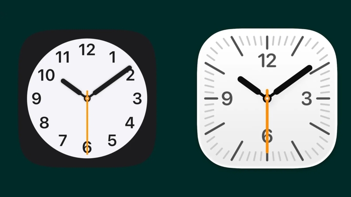
The biggest change is the clock app icon design, as the round watch face is switched to a square one. (Left: Old icon - Right: New icon)
Image
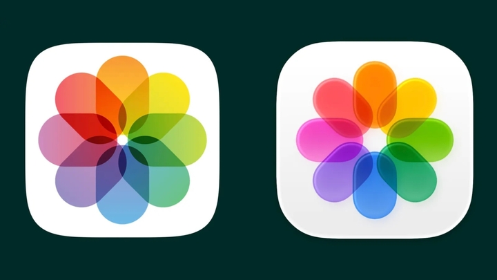
(Left: Old icon - Right: New icon)

(Left: Old icon - Right: New icon)
Note

(Left: Old icon - Right: New icon)
Contacts

(Left: Old icon - Right: New icon)
Message
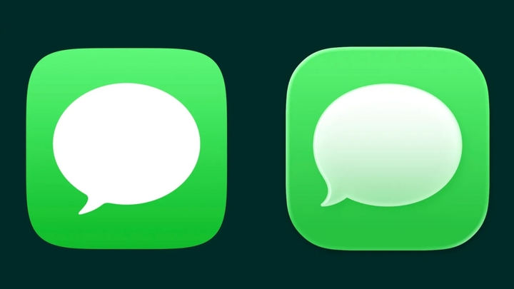
(Left: Old icon - Right: New icon)
App Store
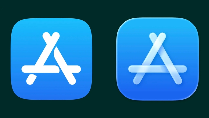
(Left: Old icon - Right: New icon)
According to Apple, the new iOS 26 icon set is expected to be released this fall.

Notable statements of Mr. Hoang Nam Tien about AI 0

NISSAR - Earth surveillance radar satellite accurate to the centimeter 0

VPN app downloads surge amid UK censorship crackdown 0
Comprehensive digital transformation of enterprises from the lessons of INDEVCO 0
Source: https://vtcnews.vn/apple-dai-tu-toan-bo-bieu-tuong-ung-dung-tren-ios-26-sau-hon-10-nam-ar957336.html


Comment (0)