
 |
Not only is it an aesthetic issue, the old red also has some technical issues. Photo: YouTube . |
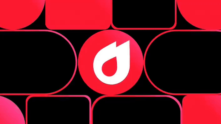
YouTube users may have noticed a small change recently. The iconic red in the platform’s logo has become softer, with a hint of pink. This is no coincidence. According to user research, YouTube’s old red color was rated as one of the top three most outdated design elements on the platform.
Last updated in 2017, YouTube’s old brand color was a pure red. However, according to YouTube’s head of visual design, Robyn Lee, this color was considered by many users to be “too bright” when used in key interface elements. This made the visual experience heavy and sometimes annoying for users.
 |
Old logo (top) and new logo (bottom). Photo: YouTube. |
The old red also had some technical issues. On some monitors, the red could appear orange, with a color shift.
The color also causes burn-in on TVs. With a color that has become a brand signature, YouTube’s design team had to be careful about making changes, according to Fast Company.
To find the new red, YouTube's design team chose hues that aligned with the company's creative principles: friendly, engaging, dynamic, and unifying.
According to YouTube product manager Linda Hong, the design team avoided colors that felt overwhelming, cold, or too corporate. Ultimately, they chose a softer red with a hint of pink to soften the brand identity.
In addition to changing the logo color, YouTube also adopted a gradient from red to bright pink, and adjusted how it uses red in its user interface. Instead of appearing everywhere, red is now limited to a few key branding elements, such as the flame icon for “trending” videos and the fireworks effect that appears when users like a video.
 |
The frequency of red appearing on YouTube will be reduced. Photo: YouTube. |
“Red is a color that is synonymous with YouTube, but if you use it too much, it can become diluted. Red needs to be special, unique, and only appear in certain places,” explains Amy Yip, lead visual designer.
This color change does not take away from YouTube's brand identity, but rather refines it to better suit the tastes of modern users. It's still the familiar red, but now it's softer and easier to see, to match a video-sharing platform like YouTube.

![[Video] More than 100 universities announce tuition fees for the 2025–2026 academic year](https://vphoto.vietnam.vn/thumb/1200x675/vietnam/resource/IMAGE/2025/7/18/7eacdc721552429494cf919b3a65b42e)


![[Infographic] In 2025, 47 products will achieve national OCOP](https://vphoto.vietnam.vn/thumb/402x226/vietnam/resource/IMAGE/2025/7/16/5d672398b0744db3ab920e05db8e5b7d)


Comment (0)