
 |
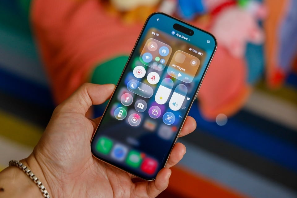
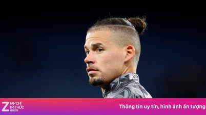
Liquid Glass on iOS 26 has received mixed reviews from the community. Photo: Gizmodo . |
The Liquid Glass interface feature on iOS 26 is facing mixed reviews from the user community. After being complained about making some content harder to read, the design is being criticized again for causing an unusual optical phenomenon that makes app icons appear tilted.
Liquid Glass was introduced by Apple as a visual improvement, adding a subtle glow effect to the corners of the icons. Thanks to that, the interface brings a glassy feel, depth and vivid visual effects. However, according to Gizmodo , this design choice has created an illusion that makes many users feel lost when using. Some reports said they even felt dizzy when looking at the icons for a long time.
On Reddit , the issue quickly became a hot topic of discussion. One related post attracted more than 3,000 comments.
“The border glow effect makes the app look tilted, very annoying,” one person wrote. Another compared the experience to feeling “drunk” after updating to iOS 26.
As reported, the tilt effect is most noticeable when using Dark, Clear, or Color modes on dark or black backgrounds. Conversely, colorful backgrounds somewhat mitigate this effect by helping to distract attention from the refractive angles.
Some users have tried tweaking the settings on their iPhones, but to no avail. Options like reducing transparency or turning on the motion reduction feature have not helped. Most people have reported seeing little to no difference after changing the settings.
It's unclear how Apple will address this issue, but users are hoping that the company will add a dedicated option to adjust or disable the Liquid Glass effect in an upcoming software update.
Source: https://znews.vn/tinh-nang-tren-ios-26-khien-nguoi-dung-kho-chiu-post1586276.html


![[Photo] Closing of the 1st Congress of Party Delegates of Central Party Agencies](https://vphoto.vietnam.vn/thumb/1200x675/vietnam/resource/IMAGE/2025/9/24/b419f67738854f85bad6dbefa40f3040)


![[Photo] Editor-in-Chief of Nhan Dan Newspaper Le Quoc Minh received the working delegation of Pasaxon Newspaper](https://vphoto.vietnam.vn/thumb/1200x675/vietnam/resource/IMAGE/2025/9/23/da79369d8d2849318c3fe8e792f4ce16)


Comment (0)