
 |
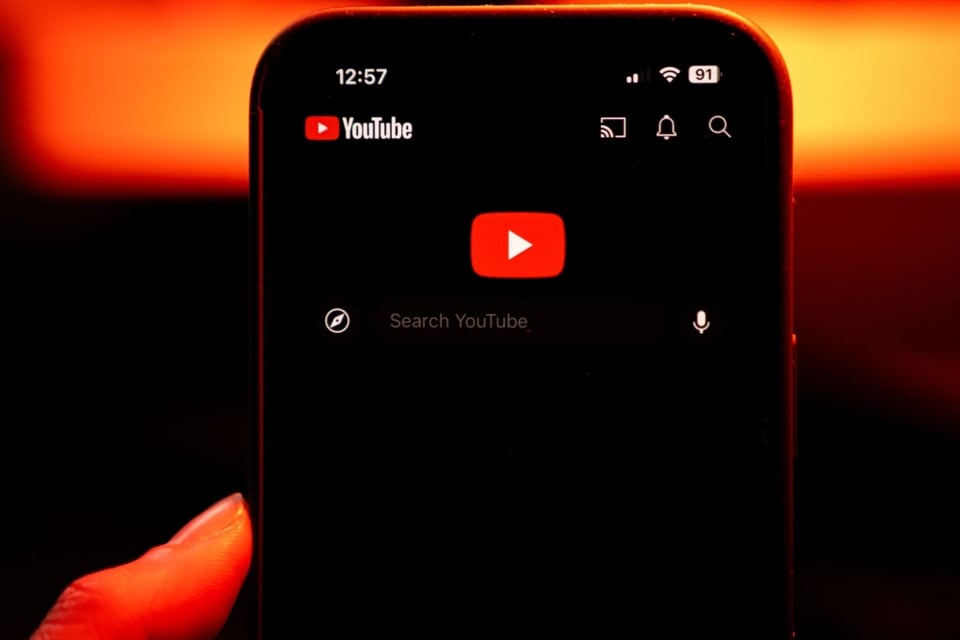
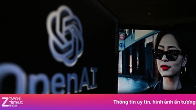
Users have mixed reactions to YouTube's new interface. Photo: Bloomberg . |
April 23rd marked 20 years since the first video was uploaded to YouTube. The world's largest video platform has also spent nearly a decade keeping the same web video player interface, making users too familiar with the layout and arrangement of function buttons. Therefore, any change can easily make users feel confused.
To mark its 20th anniversary, YouTube's parent company, Google, tested a new user interface for its web video player. However, the change immediately caused a lot of controversy.
Some users have reported that the new interface has appeared on some videos. Reddit user NoSpHiel shared that he saw the interface on his secondary account, but his main account remained the same, suggesting that Google is conducting a limited test.
The new interface features a prominent design with Play/Pause, Next, timestamp, and video chapter buttons housed in separate capsule-shaped frames. The volume control has been moved to the opposite side, grouped with icons like share and subtitles. Additionally, the black translucent layer below the video has been replaced with translucent buttons for easier readability and a cleaner full-screen viewing experience.
However, not everyone is happy with this change. While some people find the new interface modern and easy to look at, many others complain about the inconvenience. In particular, the volume slider is a big point of contention. According to feedback, users can no longer move the mouse to scroll or use the up/down keys to adjust the volume, a change that is seen as a decrease in the user experience that has long been familiar.
Currently, YouTube has not given an official response on whether the new interface will be widely deployed in the near future.
Source: https://znews.vn/giao-dien-moi-cua-youtube-gay-tranh-cai-post1548767.html


![[Photo] Ready for the 2025 Fall Fair](https://vphoto.vietnam.vn/thumb/1200x675/vietnam/resource/IMAGE/2025/10/14/1760456672454_ndo_br_chi-9796-jpg.webp)


![[Photo] General Secretary To Lam chairs the meeting of the Central Steering Committee on science, technology development, innovation and digital transformation](https://vphoto.vietnam.vn/thumb/402x226/vietnam/resource/IMAGE/2025/10/15/1760500443782_anh-man-hinh-2025-10-15-luc-10-52-47.png)


Comment (0)