In late February, many iPhone users reported that after updating the Messenger app on iOS to the latest version, the messaging software from Meta changed the color of the message icon on the logo from purple to a blue bubble on a white background. About a week prior, this change also occurred on the Android operating system. Thus, the Messenger logo on both of the most popular mobile platforms is now synchronized in terms of appearance.
The new app icon reverts to using two shades of blue and white, similar to previous logos, except for the period from 2020 to early 2025 when the software used purple in a blended style: a range of purple, pink, and orange combined and smoothly transitioning to create different tones and shades, instead of using a single color. At that time, Meta stated that the change was to synchronize the product with Instagram – another app also owned by this "tech giant".
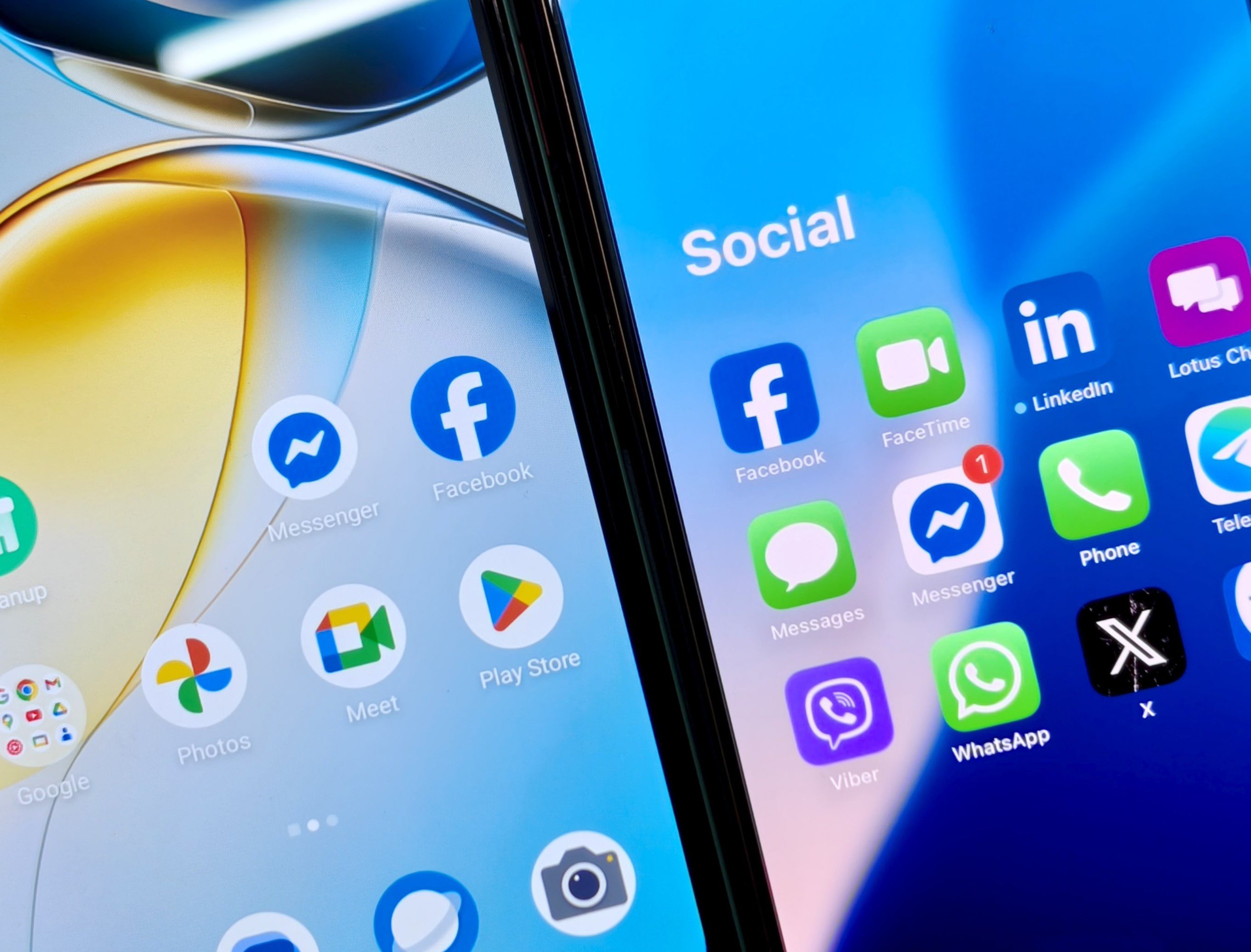
Messenger has changed its app color scheme on both Android and iOS after nearly five years of using a purple-pink-orange style.
Meta has yet to make an official announcement regarding this recent change. All current explanations are based on user speculation, possibly including coincidences related to the US presidential term. After Donald Trump took office, Meta made several significant moves, leaning toward the president's hardline views, for example, on gender issues.
In addition, some argue that the return to the traditional blue and white logo stems from Meta's realization that users have a strong connection to the original design, viewing it as a symbol of simplicity and easy recognition; or that the company adjusted its brand strategy, focusing on clearly differentiating between different applications and services instead of integrating them as in the past...
Users are confused by the "new yet old" Messenger logo.
After nearly five years of using the stylish purple Messenger logo on a white background, users had become accustomed to the app standing out in their list of messaging applications. Therefore, the switch back to the blue and white color scheme caused confusion and difficulty for many users in finding the app from their device's list.
Ms. Viet Nga ( Hanoi ) said that after the update, she still hasn't gotten used to the changes in Messenger, so every time she uses this messaging service, she wastes time searching and identifying it in the menu on her phone. "It's so frustrating, I'm not used to the blue and white color scheme, so every time I open Messenger this morning I have to search," she confided, as the communication apps she frequently uses, such as Messenger, Facebook, Zalo, and Telegram, all have similar color tones, causing her to accidentally select the wrong service many times.
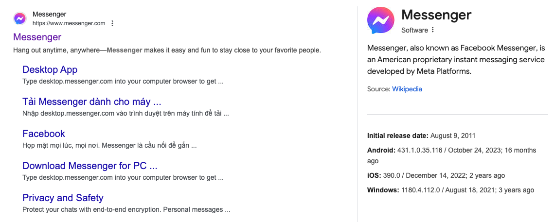
The Messenger app icon color remains unchanged when searching on Google.
Many other phone users also reported that they found it difficult to distinguish between the apps after the change. "Facebook, Zalo, Telegram, Messenger, LinkedIn all look pretty much the same at a glance," one user said.
Since separating from the main app in 2011, Messenger's interface has undergone significant changes. Initially, the icon was simply a blue speech bubble with a white lightning bolt, representing instant and direct communication. Throughout the 2013 and 2018 updates, this design was only slightly refined, with rounded edges and a more approachable style, but still maintaining Facebook's signature blue color scheme.
The turning point came in October 2020, when Meta unveiled a completely new logo with a gradient color scheme of purple, pink, and orange, inspired by Instagram's color palette. This transition was not only aesthetic but also reflected the company's intention to merge Messenger with Instagram Direct Messages, aiming for cross-platform interaction.
Source: https://thanhnien.vn/messenger-doi-mau-ung-dung-nguoi-dung-lung-tung-185250228151732375.htm


![[Photo] Prime Minister Pham Minh Chinh receives Lao Minister of Education and Sports Thongsalith Mangnormek](/_next/image?url=https%3A%2F%2Fvphoto.vietnam.vn%2Fthumb%2F1200x675%2Fvietnam%2Fresource%2FIMAGE%2F2025%2F12%2F16%2F1765876834721_dsc-7519-jpg.webp&w=3840&q=75)














Comment (0)