
 |
The Start menu in the latest version of Windows 11 has many improvements. Photo: PCMag . |
Users can search for apps faster, easily manage pinned items, and even remove the " Recommended " section if they want a simpler interface. While not perfect and still having some limitations, the new design is a step in the right direction for Microsoft.
Bigger, better
With the latest update, Microsoft redesigned the Start menu for the first time since the launch of Windows 11. One of the most noticeable changes is that the menu is larger than before and neatly organized into three sections: Pinned , Recommended , and All .
By default, the Pinned section displays two rows of apps, with six apps per row on small screens and eight apps on large screens. If there are more pinned apps, users can click Show all to expand the view. If there are fewer pinned apps, this section will automatically collapse into a single row.
") |
The new Start menu layout after removing the Recommended item. Image: MakeUseOf. |
Another major improvement is that users no longer have to click the "Show all" button to view applications. You simply scroll down and the applications will appear. Windows offers three different ways to view applications: Category, Grid, and List.
The category view organizes applications into Productivity , Social , Creativity , and Games folders. Frequently used applications appear at the top of the list. Windows only creates a category if there are at least three matching applications; otherwise, the applications appear in a general category called Other at the bottom.
Control the Start menu layout.
For many people, the Recommended section in the Start menu is a nuisance. This is where Windows displays newly installed applications, recently used files, and even annoying application suggestions or advertisements.
In previous versions, users could hide individual suggested items, but couldn't completely disable the entire section, which was really annoying.
") |
Users can further customize the Start menu. Image: MakeUseOf. |
With the new Start menu, that annoyance is gone. Now, all you need to do is go to Settings > Personalization > Start and turn off all three toggles in the Recommended section. After that, the section disappears completely.
The Start menu now only has the Pinned and All options, making it look much cleaner.
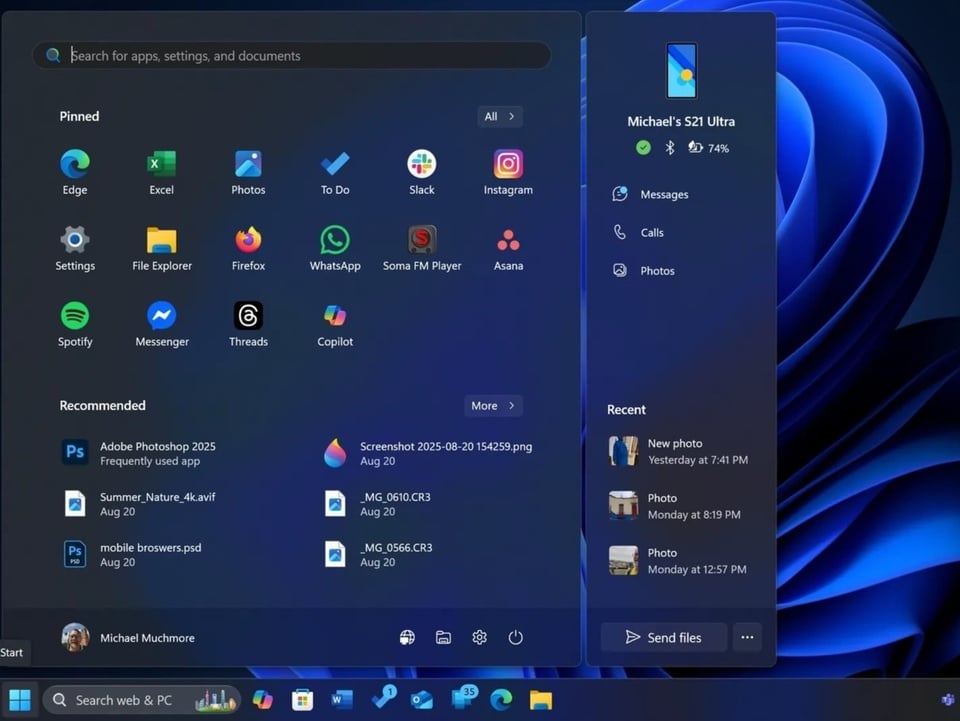
Quickly access messages, calls, and files on your phone.
Phone Link is one of Microsoft's best apps for anyone who frequently uses a PC. It's packed with useful features, and Microsoft has added it to the sidebar in the new Start menu.
Although this change appeared before the 25H2 update, it's still worth highlighting as it's part of the new Start menu.
From the Start menu, Phone Link allows users to view their phone's battery and connection status, access messages and calls, and track recent activity. It can even share files between the phone and PC without opening a separate application.
") |
Phone Link offers many advantages when displayed as a sidebar in the Start menu. Image: MakeUseOf. |
Of course, Phone Link isn't for everyone. The tool may or may not be useful depending on how it's used. If users don't like it, they can easily hide it in the Start menu settings.
Not perfect, but a good start.
Despite all the improvements mentioned above, the Start menu still has some limitations. Users still cannot customize its size, especially now that the menu area has increased significantly. This is particularly noticeable on smaller laptop screens.
Another annoying aspect is that when searching for apps, settings, or files, Start immediately switches to a smaller search menu, which can be somewhat irritating.
Nevertheless, the new Start menu is a commendable improvement. It's not perfect, but it's not so bad that users would want to look for an alternative.
With easier app access, the option to completely remove the Recommended section, and convenient additions like Phone Link, it seems Microsoft has listened to user feedback to some extent.
Source: https://znews.vn/van-de-lon-tren-windows-11-duoc-khac-phuc-post1601145.html


Comment (0)