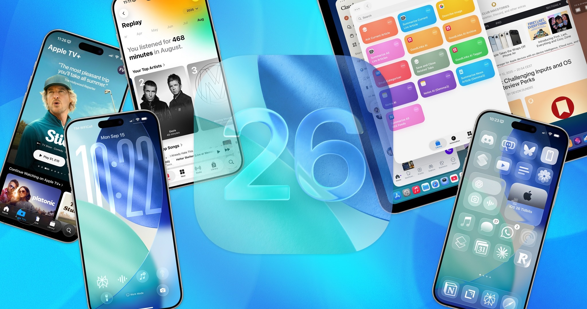
Apple has just officially released iOS 26. After a disappointing year where many Apple Intelligence features didn't launch as planned, this update focuses on improving the interface with the Liquid Glass design, along with several tweaks to enhance the user experience.
In fact, many people have been using iOS 26 during the beta testing phase. Learning from iOS 18, most of the features Apple showcased at WWDC 2025 are included in the final version.
Following its official release, many international news outlets praised the upgrades in iOS 26, although some areas still need improvement, particularly regarding the new interface.
First impressions of Liquid Glass
Writing on CNET , author Zachary McAuliffe expressed his admiration for the Liquid Glass interface. The lighting and movement of interface elements create a pleasant feeling. Of course, none of this affects how the iPhone functions.
"The changes to Liquid Glass are more focused on aesthetics than functionality. While the menus look different and the buttons when opening the Control Center look sleeker, you'll feel familiar with using them," McAuliffe said.
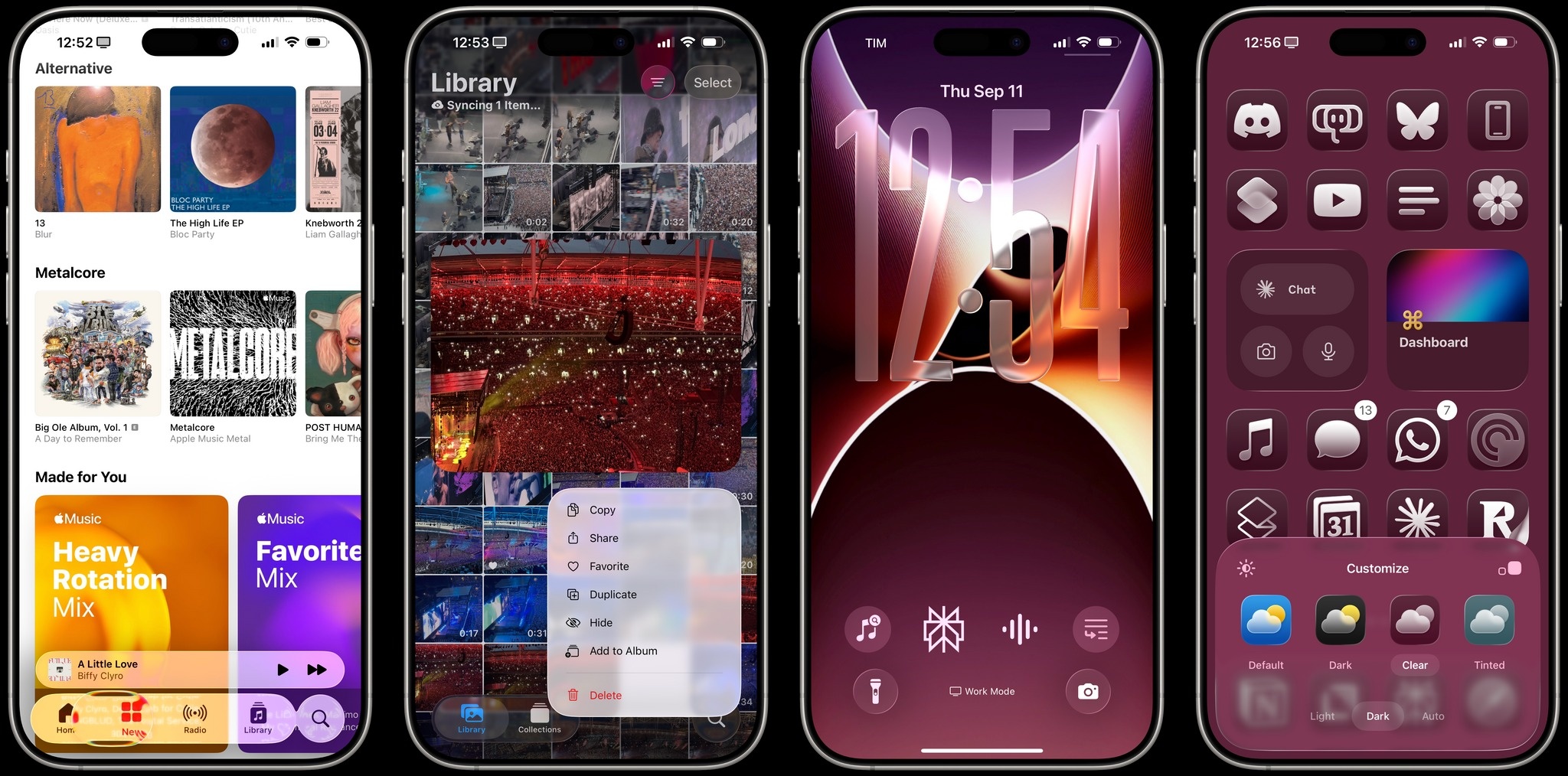 |
The Liquid Glass interface of iOS 26. Photo: MacStories . |
Apple applies Liquid Glass across all platforms. However, author Dan Moren from Six Colors argues that this interface is still most comfortable to use on iPhones and iPads due to its better interactive effects. For example, images and text will appear three-dimensional when swiped to open the notification bar, or distort/change color if placed below the toolbar.
"This is quite impressive but sometimes distracting. At times, you'll see the text distort compared to what you're reading. When the scrolling content suddenly switches from light to dark, the buttons also change color, which can sometimes be annoying," Moren commented.
With the glass element, Apple made some adjustments to avoid discomfort. For example, when viewing black content on a white background and swiping across to darker content, the interface will switch between light and dark states faster or slower based on scrolling speed. While clever, Moren believes things didn't need to be that complicated.
“This is reminiscent of the old parable when the U.S. spent years and millions of dollars designing a pen that could write in space, while the Soviet Union only used pencils. Apple shouldn’t have needed a design that required immediate interface tweaking,” Moren added.
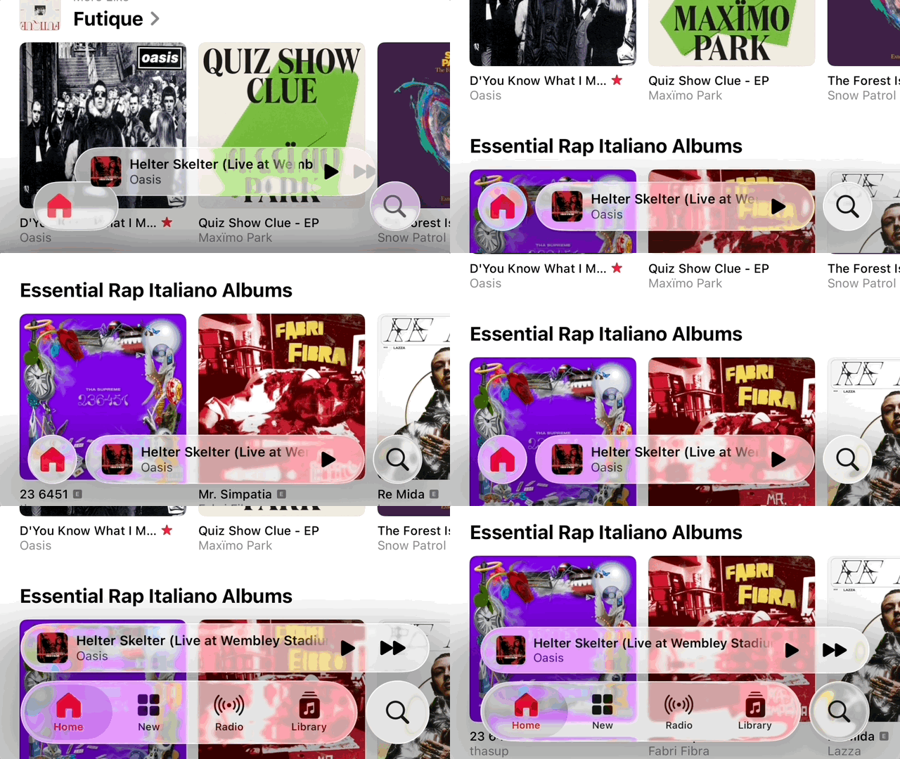 |
The transparent, three-dimensional effect of Liquid Glass on iOS 26. Photo: MacStories . |
If "Glass" speaks of a new look, the "Liquid" section emphasizes the effect and feel. The split, bouncy, and floating buttons are exactly like the design of Dynamic Island.
According to Moren, this design makes interface changes easy to recognize but is inconsistently implemented, especially with frequently changing button positions. After viewing it multiple times, the animations can easily become distracting.
It takes time to get used to it.
Apple also changed some fundamental elements of iOS, such as the horizontal scrolling menu. Instead of putting everything in a long row and forcing users to scroll multiple times, the new layout only displays a few options. When you tap the arrow on the right, all options expand vertically, making them easier to see and select.
The app icons on iOS 26 have been redesigned with transparent layers. Users can still choose between light, dark, solid color, or transparent styles. Although this feature has been around since iOS 18, the ability to customize the home screen is still worth trying with the new interface of iOS 26.
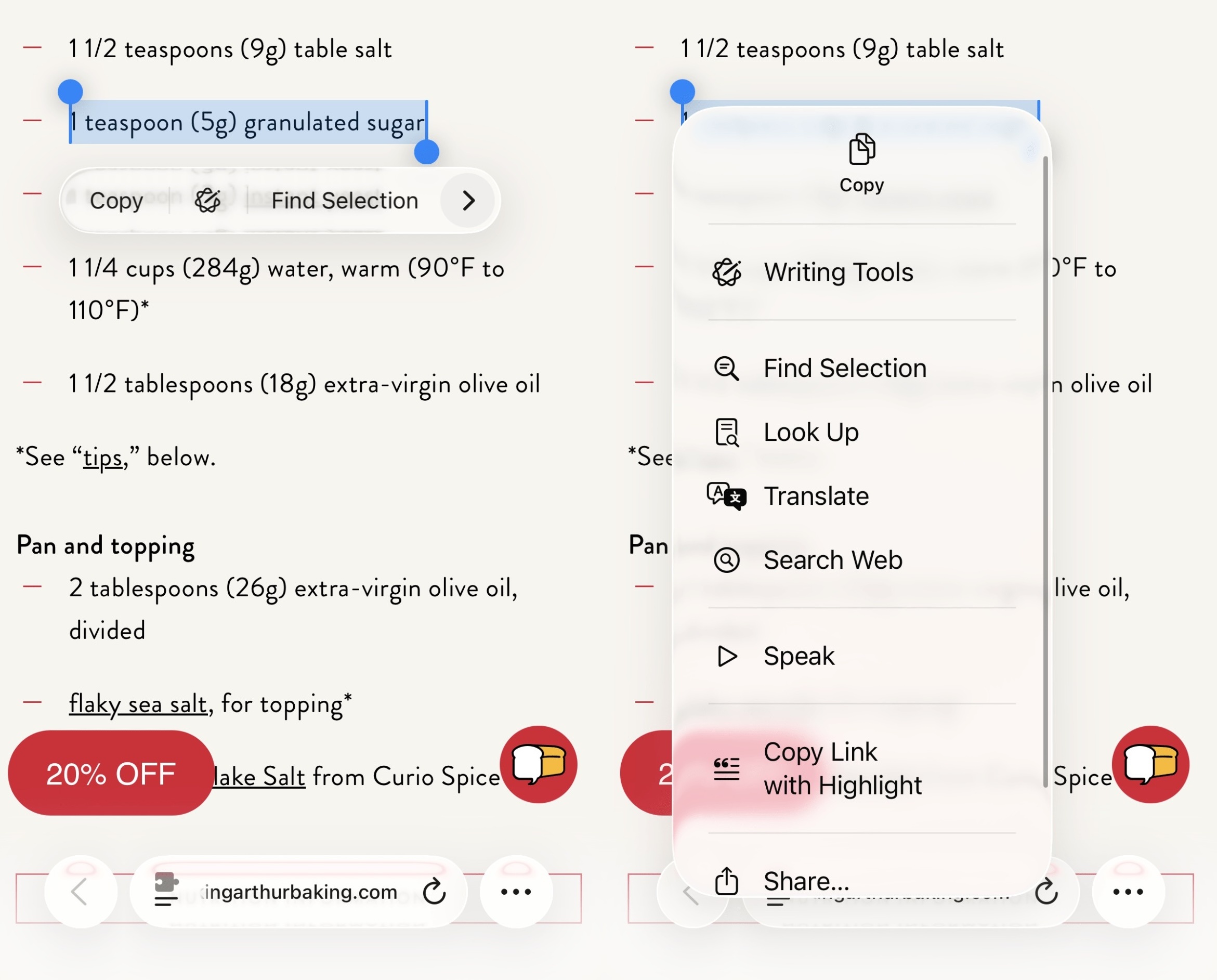 |
The new horizontal scrolling menu interface in iOS 26. Photo: Six Colors . |
iOS 26 adds several lock screen customization options. The biggest addition is the clock size, which can be stretched or shrunk to fit the background wallpaper. Because Apple's automatic system isn't perfect, it may take some time to manually adjust the wallpaper position and clock size for the best results.
When resizing the clock, the widget's position is moved to the bottom of the screen so as not to obscure the subject of the photo. Users also have the option to enable a 3D effect, creating a three-dimensional feel for details in the photo when tilting the phone.
According to McAuliffe, the only drawback of the watch resizing feature is that it only applies to one font style. However, the ability to customize color and font thickness remains unchanged.
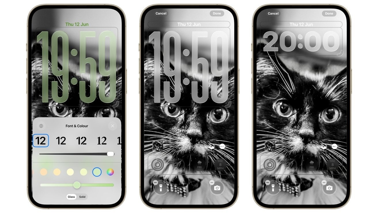 |
The ability to customize the lock screen has been expanded in iOS 26. Photo: AppleInsider . |
While listening to music, the album art will display in full on the lock screen, with added animation effects if supported by the publisher. So far, this change has received many positive reviews on social media.
Overall, Dan Moren from Six Colors believes users need time to get used to the new interface. Much of the feedback on the design remains subjective, and Apple will need to gather opinions to refine the interface further.
Focus on minimizing the number of applications.
The camera app is one of the most used apps on the iPhone, evidenced by Apple's continuous improvements to the camera over the years. In iOS 26, the camera app was upgraded to be more minimalist and user-friendly.
When accessing the camera app, users only see two main modes: photo capture and video recording. Secondary modes such as portrait mode and slow-motion recording only appear when swiping left or right, reducing the chance of accidentally selecting the wrong option.
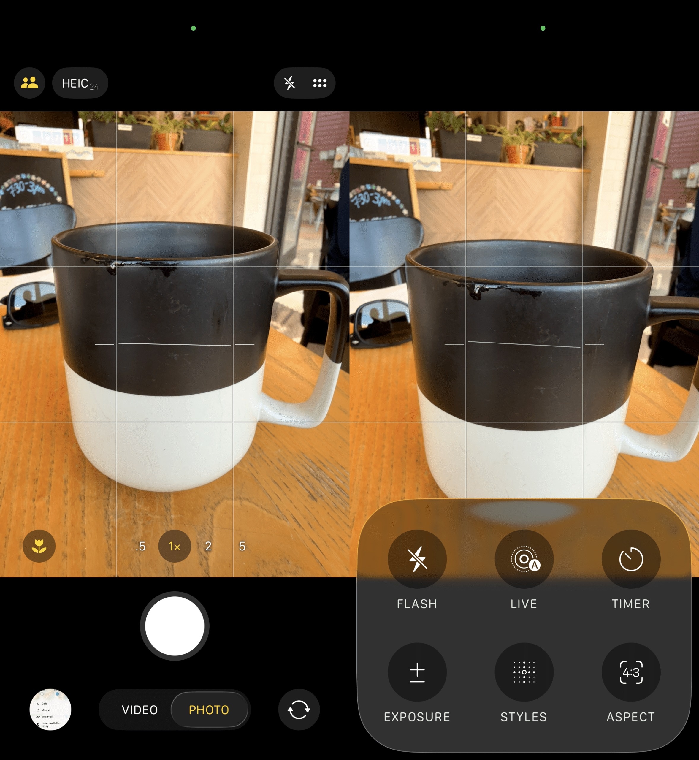 |
The Camera app on iOS 26. Photo: Six Colors . |
Similarly, advanced controls such as aperture, exposure, color effects, etc., are only displayed when swiping or tapping the menu icon in the upper corner of the screen.
"Apple's new design reflects the reality that users just want to open an app, take a photo or record a video, and then exit. The company itself designed the hardware so that the iPhone takes beautiful photos without much adjustment," Moren emphasized.
The Camera app on iOS 26 also adds several AirPods-related features. When using models with the H2 chip, audio recording quality is improved. Additionally, the AirPods control button can now be used for remote photo taking.
Apple also streamlined the phone app in iOS 26. With the Unified layout, favorite contacts are moved to the top, while call history is below. The contacts and keyboard sections are separate.
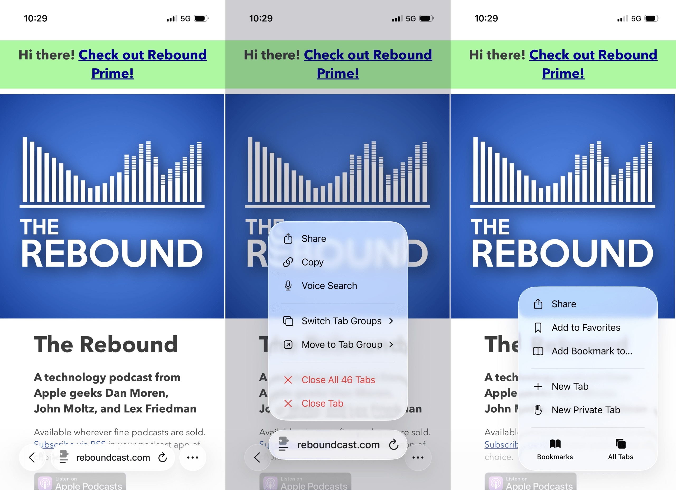 |
The Safari interface on iOS 26 has a more minimalist design. Photo: Six Colors . |
Despite not having many major improvements, Apple has refined the Safari interface towards a minimalist approach. In iOS 26, the familiar toolbar with navigation, share, and bookmark buttons has been removed. Instead, the Safari interface now only includes a back button, an address bar, and a menu for expanding control.
Writing on Six Colors , author Dan Moren admits to being familiar with the interface, but sometimes the website's background color doesn't match the Liquid Glass. This results in different color effects between elements, making it frustrating to use.
Minor improvements
Similar to other major updates, iOS 26 brings several minor improvements. For example, the management section in settings has been redesigned, displaying the last charge time and the remaining full charge time. The graph below shows battery usage compared to the daily average.
Users can switch the recording device using the Local Capture feature to the built-in microphone, AirPods, or an external microphone via the USB-C port. With AirPods, iOS 26 allows you to pause music while sleeping.
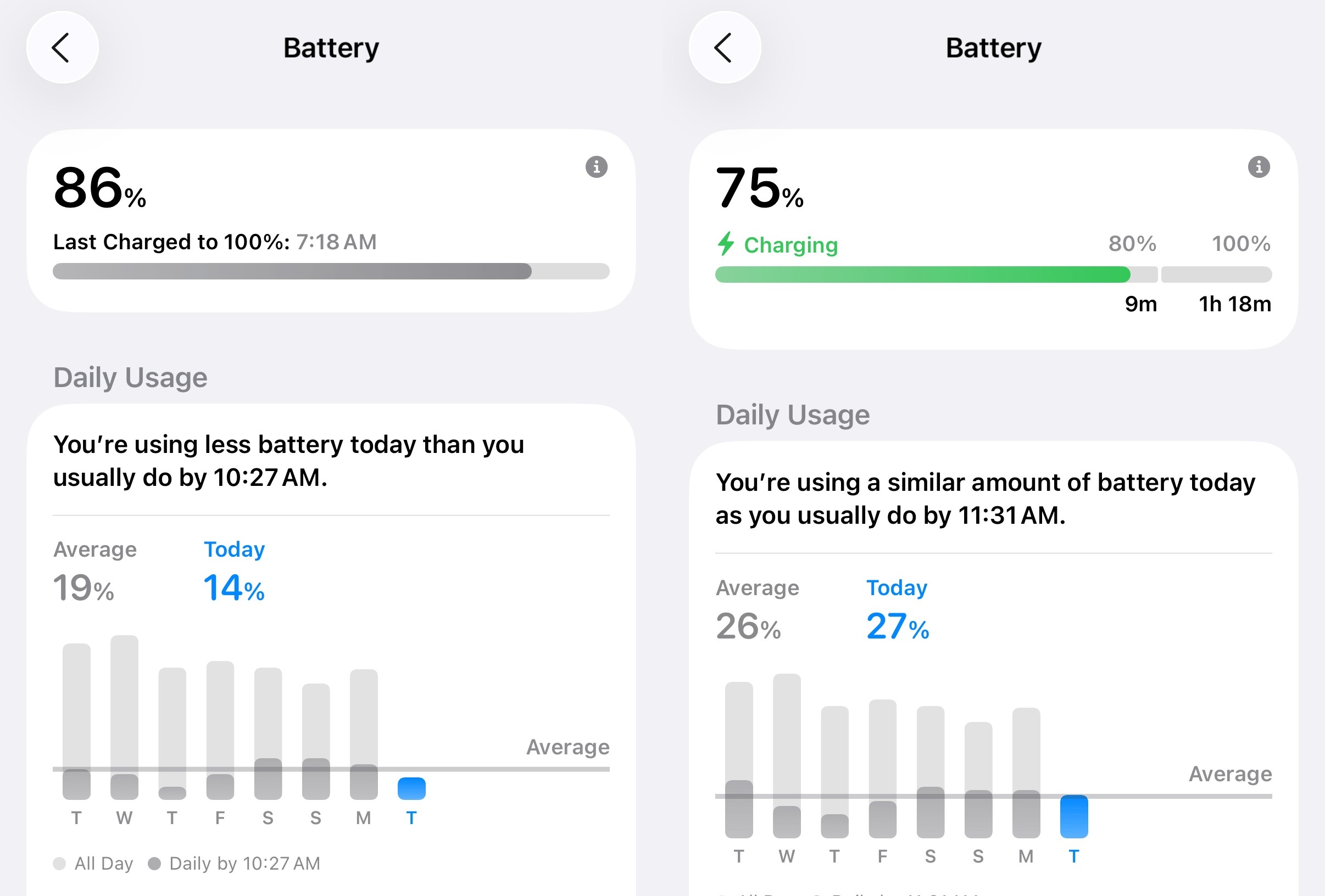 |
New battery management section in iOS 26. Photo: Six Colors . |
While somewhat useful, Moren argues that this mode lacks customization options, such as adjusting the time or adding exception apps, especially for those who rely on white noise to fall asleep.
Next, the Passwords app adds a section for editing history. The Photos app separates the gallery and photo viewing interface into two distinct sections.
Apple Music now has an AutoMix mode, which uses AI to create smooth transitions between two songs. According to Moren, this feature sometimes over-adjusts, on one occasion slowing down the track for 30 seconds to match the rhythm of the next song.
"As a new feature, it's quite interesting. However, I think many people will be annoyed by the feature that automatically adjusts their favorite songs," said a writer from Six Colors .
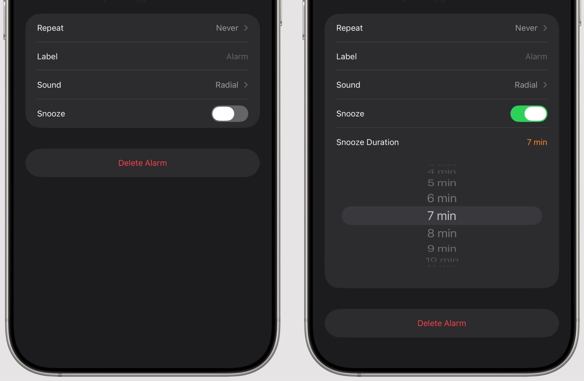 |
The snooze feature on iOS 26. Photo: MacStories . |
In the Clock app, users can adjust the interval between alarms instead of the previous fixed 9-minute interval. Additionally, the Messaging app supports custom background images and polls, making group chats less monotonous.
Games is also a new app on iOS 26, designed for gamers to communicate and challenge friends. However, Zachary McAuliffe from CNET noted that the app is not yet complete, as it cannot delete games from the library and the controller connection process is not intuitive.
There's still time to complete it.
With iOS 26, Apple introduced the Liquid Glass interface along with several minor improvements to the user experience. Moren admitted he wasn't entirely convinced by the new interface, as the effects sometimes felt "like looking at the screen through a distorted mirror."
"However, this isn't a disaster that will make everyone flee. Very few iPhone users don't update their software. I don't think many people will stay on iOS 18 just because they're annoyed with the new interface," the writer from Six Colors emphasized.
Another noteworthy point is that Apple almost completely avoids directly mentioning Apple Intelligence. There are still upgrades centered around Visual Intelligence and shortcuts, but many people might still ignore them if they're not interested.
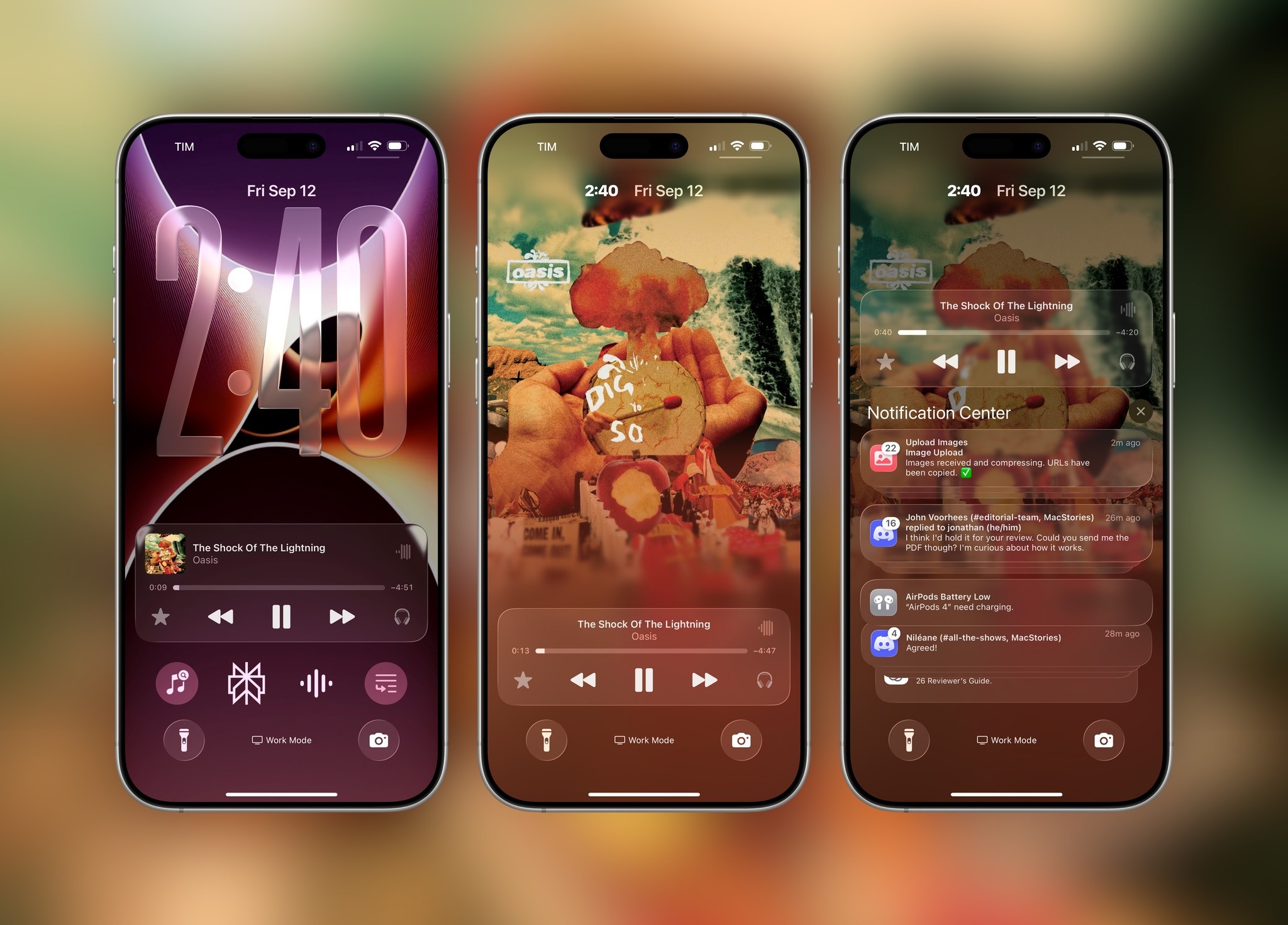 |
New interface elements in iOS 26. Photo: MacStories . |
"Apple still wants people to remember that AI features exist, but you can absolutely ignore them and continue using the device normally," Moren commented.
Overall, the future of iOS 26 heavily depends on third parties, from apps switching to Liquid Glass to the ability to leverage Apple's AI model. Currently, minor improvements like blocking unknown calls, predicting battery charging times, and AutoMix are just enough to justify an upgrade.
"iOS 26 is the next step after iOS 18. Although some features are not yet perfect, Apple can still improve them in subsequent updates," McAuliffe concluded.
Source: https://znews.vn/ios-26-co-gi-thu-vi-post1585977.html


Comment (0)