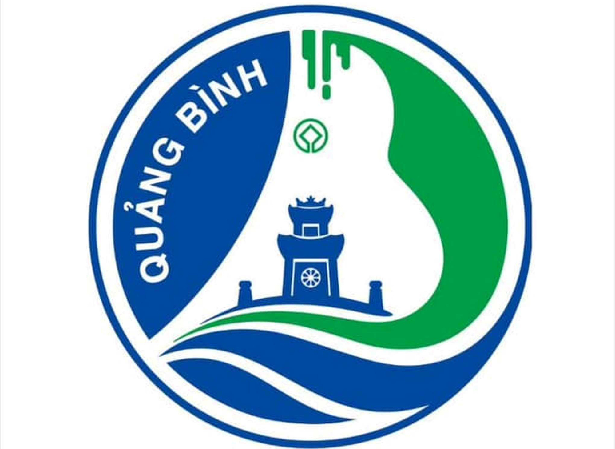
The winning logo design was sent back by the Quang Binh Department of Culture and Sports - Photo: Q.NAM
On May 26th, the Department of Culture and Sports of Quang Binh province confirmed that it had mistakenly sent the first-prize winning entry of the province's logo design competition to media outlets.
The department then resubmitted the official winning entry.
"Due to an oversight by the support staff, the winning logo design was mistakenly sent to the wrong person. The leaders of the Department of Culture and Sports deeply regret this incident," the department's announcement stated.
Compared to the mistakenly sent logo, the replacement logo includes a section of the UNESCO World Heritage Committee's emblem in the center. Additionally, the features, referred to as "stalactites," are more streamlined and rigid.
This first-prize winning logo belongs to the entry with code number: BT190A (M02) by author Hoang Thi Thu Thao.
However, on social media forums, many opinions suggest that the two logo designs are fundamentally similar, disagreeing with the awarding of first prize to this particular design.
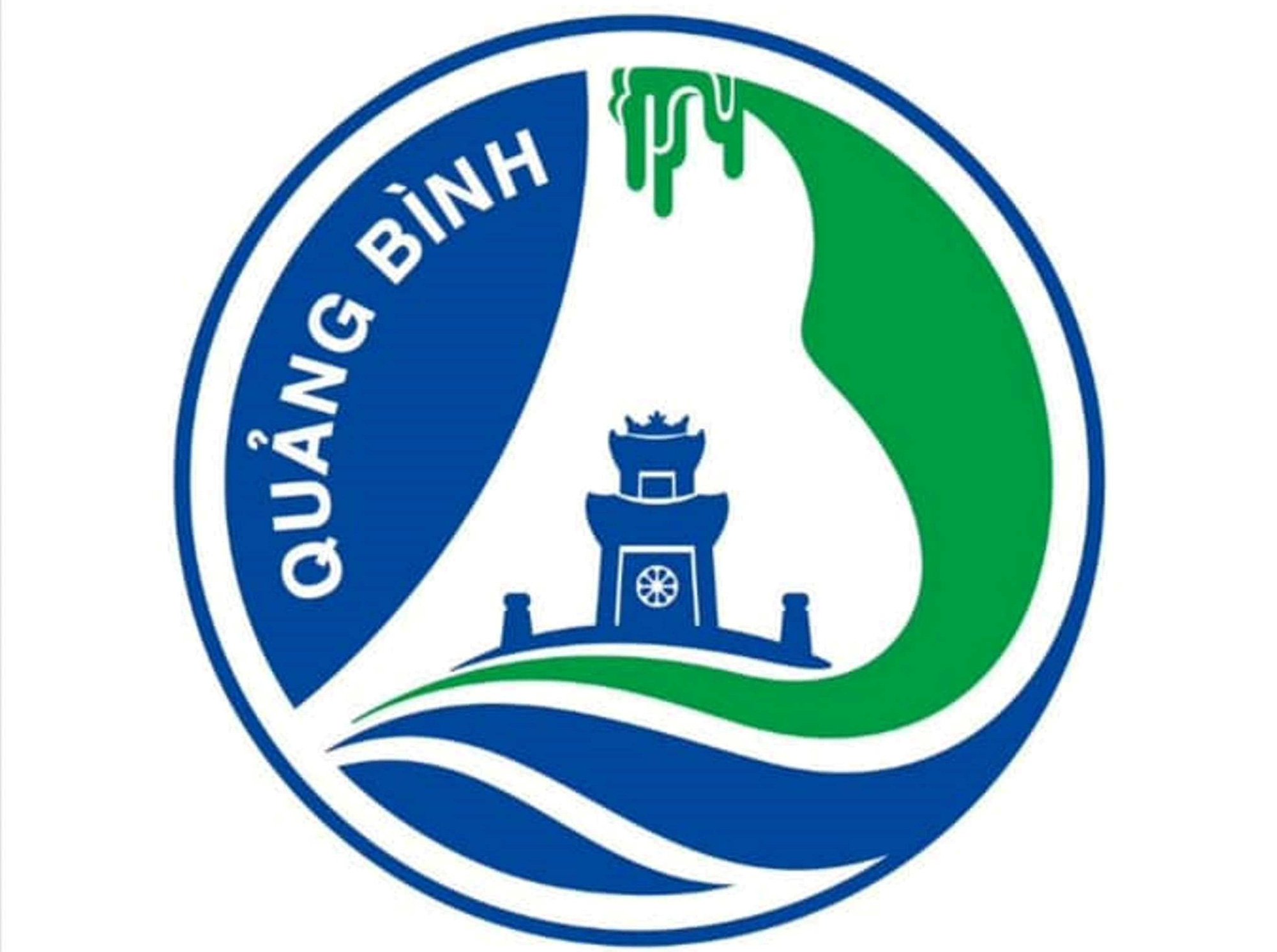
The logo design was submitted by mistake earlier - Photo: Q.NAM
Most opinions suggest that the winning logo design is too outdated, lacks modernity, and is cluttered with too many unnecessary details.
According to the explanation of this work by the Department of Culture and Sports of Quang Binh province, the overall composition of the logo is a stylized version of the two letters Q and B (Quang Binh).
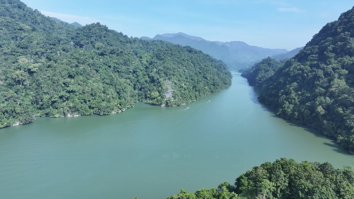
"The letter Q is shaped into a undulating curve, symbolizing the Gianh River… The letter B is designed like majestic mountain ranges and caves, representing Phong Nha - Ke Bang National Park..."
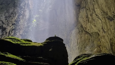
"The sound of the letter B, combined with the stalactites, creates the exquisite and magnificent beauty of Son Doong Cave, the world's largest cave, a globally outstanding value..." - the explanation states.
Additionally, the image of Quang Binh Gate on the logo is explained as a centuries-old monument of immense historical and military value.
Regarding the dominant colors, the description primarily mentions blue and green.
Blue represents the vast sky and ocean, symbolizing the aspiration for global integration and development. Green signifies Quang Binh province, with its diverse natural ecosystem and sustainable tourism development linked to local culture, reflecting the unique character of the destination.
Source: https://tuoitre.vn/quang-binh-gui-nham-tac-pham-dat-giai-nhat-sang-tac-logo-ban-moi-van-bi-che-20240526112006779.htm









![[Photo] Prime Minister Pham Minh Chinh holds a phone call with the CEO of Russia's Rosatom Corporation.](/_next/image?url=https%3A%2F%2Fvphoto.vietnam.vn%2Fthumb%2F1200x675%2Fvietnam%2Fresource%2FIMAGE%2F2025%2F12%2F11%2F1765464552365_dsc-5295-jpg.webp&w=3840&q=75)




















Comment (0)